Yesterday a facebook friend of mine put up an angry post regarding misuse of the word "decimate". His chief complaint was that people used it as a synonym for destroy, when really it meant a reduction of 10% or so. That cleared up the "deci" part of the word for me, but I was surprised that the proper definition was so narrow....so of course I went to dictionary.com to check his facts.
Turns out the "one in ten" definition is specifically marked as obsolete. The current accepted definition is merely "to destroy a great number of". So basically it can't be used to sub in for obliterate, but the 10% definition was only valid through the year 1600 or so. Sigh.
I'm not a big fan of people who try to get too cute when picking on the language of others. While I certainly am irritated by some of the more obvious errors in language (irregardless makes me cringe, and please don't mix up "less" and "fewer" in my presence), I dislike when people go back several hundred verbal years and then attempt to claim that's the "proper" way of doing things. This annoys me enough that my brother bought me this book a few years ago, just to help me out. I believe language will always be morphing to a certain extent, and while rules are good we just need to accept that all language is pretty much arbitrary. Thus, I refer to myself as a linguistic pragmatist. Adhere to the rules, but accept that sometimes society just moves on.
Why am I bringing this up? Well, after going through that internal rant, I found it very interesting that this study is being reported with the headline "Popular kids who tortured you in high school are now rich".
Basically, researchers assessed how popular kids were in high school, based on how many people gave you "friendship nominations" and found that those in the top 20% made 10% more money 40 years later than those in the bottom 20%.
Now I think this makes a certain amount of sense. While the outcast nerd makes good story is appealing, it stands to reason that many of the least popular kids in high school might be unpopular because of real issues with social skills that hurt them later in life (to note, social skill impairment is a co-morbidity with all sorts of things that could make this worse....ADHD, depression, etc). Conversely of course, those with more friends probably have skills that help them maintain networks later. Basically, I think this study tells us that the number of friends you have in high school isn't totally random.
My issues with the reporting/reading of this study is in the semantics. I think there's a disconnect between our common interpretation of "popular in high school" and the actual definition of "popular in high school". The researchers in this study weren't assessing the kids other kids aspired to be, they were assessing the kids who actually had lots of friends and were well liked. While the classic football player who beats up kids in the locker room may get referred to as a popular kid, it's likely he would not have had many people naming him as a friend on a survey. So basically, the study had a built in control for those kids who were temporarily at the top of the social ladder, but lacked actual getting along with people skills. I had an incredibly small high school class (<30) and I could name several kids who fell in the "perceived popular" category but not the "actually popular" category.
All this to come back to my original point. Words mean different things depending on context, and this should always be taken in to account when assessing research and reading subsequent report. It's not bad data, just a different set of definitions.
Showing posts with label Bad Journalism. Show all posts
Showing posts with label Bad Journalism. Show all posts
Wednesday, October 24, 2012

Friday, September 14, 2012
Gender pay gap - Categories and equivalencies
Amy Alkon (aka the Advice Goddess) had an interesting piece over on her blog about the gender pay gap stat that keeps getting floated around. By the way, if you're at all libertarian leaning and hate the TSA, she's a good read.
Anyway, I've posted before about the gender pay gap stat, and how it's fairly deceptive, but her post triggered a point I hadn't thought about previously. Apparently the stat (that women make 75-81 cents per dollar that men make) is based on full time year round workers. Alkon quotes another article that mentions that "full time" means anything over 35 hours.
Now obviously this accounts for some of the disparity in pay gap. We all know high achievers who work 70 hours a week, and to lump them in with those working 35 is silly.
It's an interesting study in categories though. When I took my assessment class in grad school, the professor showed us a study that had been done on the number of sex partners a person had. The options were:
- 0
- 1
- 2
- 3
- 4+
He pointed out two issues with this setup. First, is there truly a meaningful difference between those who had 2 partners and 3? How about those who had 3 partners and "4+"? Is everyone with 4 or more partners really equal?
This mirrors the paycheck issue pretty well. We'd all expect someone work 40 hours to make more than someone working 20 hours, but none of the calculations take in to account that someone working 60 hours will also make more than someone working 40 hours. Alkon also links to this piece by Kay Hymowitz that gives this quote:
In 2007, according to the Bureau of Labor Statistics, 27 percent of male full-time workers had workweeks of 41 or more hours, compared with 15 percent of female full-time workers; meanwhile, just 4 percent of full-time men worked 35 to 39 hours a week, while 12 percent of women did. Since FTYR men work more than FTYR women do, it shouldn’t be surprising that the men, on average, earn more.She also mentions the term "proofiness"....the use of misleading statistics to confirm what you already believe. Love that.
Anyway, I'm all for equal pay for equal work, but only if we're really talking about equal pay AND equal work.
Bad categories, bad.
Bad categories, bad.
Tuesday, September 11, 2012
Kids these days
There's a certain brand of newspaper headline that used to really annoy me when I was a teenager. At the time I dubbed them "kids these days" headlines....essentially headlines that play to older people's love of fretting over how bad things are in the younger generation. Prime examples are pretty much on repeat: they're lazy, they're not getting the education the older generation got, they're irresponsible, they're selfish, they like bad music.
I mean, my retirement accounts are doing fairly well thank you very much, but I opened the first one when I was exactly 22....you know, after I got my first post college full time job. Coincidentally, that was also the first time I gave any serious thought to the entire concept of retirement.
They don't provide any information about the age distribution of the respondents, but if it was even, 40% of kids in a group of that age range would be 13 to 16. I've never parented a teenager, but it strikes me that most parents of kids in that age range probably aren't having in depth discussions with them about their financial situation, and certainly not about their retirement savings. Even those who are teaching financial lessons to their kids probably limit their disclosure about specific numbers. Asking kids in that age range to have an educated opinion about this is ridiculous.
One more thing....I don't know what kids they polled for this study. However, the chances that an investment firm polled children of it's own clients is pretty high. Parents who have investment firm accounts are probably more likely to actually be leaving their kids an inheritance, correct? It's suspicious to me that they go from their own specific study to a "in general parents aren't leaving their kids money". How about the kids of these parents?
Alright, that's all I can say without seeing how this study was actually done. Now get off my lawn.
I'm over a decade removed from teenagerhood, but my gosh do I still hate those headlines. I am pretty much of the opinion that every generation has their own pluses and minuses, and we all need to chill out. Headlines that say "hey, this new generation really figured out a bunch of stuff our target demographic totally screwed up" are just not going to sell.
ANYWAY, I saw a good example of this in USA Today (via Instapundit) with the headline "Younger people expect inheritance that won't exist".
Oh those darn kids! Always expecting their parents to support them. Entitled whipersnappers!
First off, this was based on a study done by TD Ameritrade. For all the issues I have with academic studies, studies done by companies trying to sell you something are even worse. Also, they almost never release their source data.
You don't have to look far to see where this one got ridiculous:
Nearly 40% of Generation Z, those ages 13 to 22, expect to receive an inheritance, according to a recent TD Ameritrade study. As a result, they don't believe that they will need to save for retirement.Seriously? They asked 13 to 22 year olds about their retirement saving ideas and then report that their expectations are unrealistic? I would be more weirded out if the study had shown that 40% of them had a comprehensive plan in place. Most 13 to 22 year olds haven't entered the full time workforce yet.
I mean, my retirement accounts are doing fairly well thank you very much, but I opened the first one when I was exactly 22....you know, after I got my first post college full time job. Coincidentally, that was also the first time I gave any serious thought to the entire concept of retirement.
They don't provide any information about the age distribution of the respondents, but if it was even, 40% of kids in a group of that age range would be 13 to 16. I've never parented a teenager, but it strikes me that most parents of kids in that age range probably aren't having in depth discussions with them about their financial situation, and certainly not about their retirement savings. Even those who are teaching financial lessons to their kids probably limit their disclosure about specific numbers. Asking kids in that age range to have an educated opinion about this is ridiculous.
One more thing....I don't know what kids they polled for this study. However, the chances that an investment firm polled children of it's own clients is pretty high. Parents who have investment firm accounts are probably more likely to actually be leaving their kids an inheritance, correct? It's suspicious to me that they go from their own specific study to a "in general parents aren't leaving their kids money". How about the kids of these parents?
Alright, that's all I can say without seeing how this study was actually done. Now get off my lawn.
Sunday, August 19, 2012
Does egg = cigarette?
Oh CNN, your headlines make me sad sometimes.
Is eating egg yolks as bad as smoking?
No. No it is not. The study you're reporting on does in fact claim that eating egg yolks accelerate heart disease about 2/3rds as much as smoking does, but acceleration of heart disease is not actually the health problem smoking is most known for. But you know that. Sigh.
Not that I'm buying the study anyway. They asked people, who already had heart disease, to report their egg yolk consumption over the course of their lives. How accurately can you recall your average egg yolk consumption over the course of your life? Additionally, people who have heart disease have most likely been told to cut down on consumption of saturated fat and cholesterol. Those still eating more eggs have likely heard this advice, and disregarded it. What are the chances that they're disregarding other advice as well? Lastly, it does not appear the study asked about the consumption of any other food, meaning egg consumption could actually just be co-occuring with the consumption of something else that was even worse. Surveys that ask only about very specific foods tend to see what they want to see.
So basically, another correlation/causation issue here, combined with those terrible consumption recollection surveys, with a sprinkle obnoxious headline writing. Yeehaw.
Is eating egg yolks as bad as smoking?
No. No it is not. The study you're reporting on does in fact claim that eating egg yolks accelerate heart disease about 2/3rds as much as smoking does, but acceleration of heart disease is not actually the health problem smoking is most known for. But you know that. Sigh.
Not that I'm buying the study anyway. They asked people, who already had heart disease, to report their egg yolk consumption over the course of their lives. How accurately can you recall your average egg yolk consumption over the course of your life? Additionally, people who have heart disease have most likely been told to cut down on consumption of saturated fat and cholesterol. Those still eating more eggs have likely heard this advice, and disregarded it. What are the chances that they're disregarding other advice as well? Lastly, it does not appear the study asked about the consumption of any other food, meaning egg consumption could actually just be co-occuring with the consumption of something else that was even worse. Surveys that ask only about very specific foods tend to see what they want to see.
So basically, another correlation/causation issue here, combined with those terrible consumption recollection surveys, with a sprinkle obnoxious headline writing. Yeehaw.
Saturday, July 28, 2012
Too hot to hire?
....or why psych undergrads would make lousy hiring managers.
I saw this study pop up on Instapundit, and while the number of "that happens to me all the time" jokes are infinite, I'm pretty sad this study got mentioned at all. Here's the Router's recap:
None.
This study didn't study women or men actually applying for jobs. They studied what happens when you give a bunch of psych undergrads a huge stack of pictures, a list of job titles and say "sort these pictures in to groups of who you think would be most qualified for a job based solely on the pictures". Seriously, that's what they did. Read the full study here.
It turns out that when you ask 65 undergrads (mostly women) to rank a whole bunch (204) of photos of people using no criteria other than what they look like, people might judge other people based on what they look like. There was some lovely statistical analysis in here, but at no point did they attempt to prove that asking a 20 year old (who presumably had no first hand knowledge about any of the fields other than psych) to sort a picture reflected at all what goes on in hiring offices.
In fact, this is what the "practical implications" section of the paper said:
While I'm sure that physical appearance does make a difference in hiring practices, I would have loved to see a little more time dedicated mimicking the real world before announcing that women were facing discrimination in certain professions. To allow these results to be propagated as proof of what goes on at legitimate companies is a bit of a stretch, and points the finger at people who never even got asked what they would do.
I saw this study pop up on Instapundit, and while the number of "that happens to me all the time" jokes are infinite, I'm pretty sad this study got mentioned at all. Here's the Router's recap:
Attractive women faced discrimination when they applied for jobs where appearance was not seen as important. These positions included job titles like manager of research and development, director of finance, mechanical engineer and construction supervisor.Oh the sad sad existence of beautiful women. To work so hard on your career and then get denied a job because you're too attractive. Now, out of curiosity, exactly how many women got rejected from these jobs for this study?
None.
This study didn't study women or men actually applying for jobs. They studied what happens when you give a bunch of psych undergrads a huge stack of pictures, a list of job titles and say "sort these pictures in to groups of who you think would be most qualified for a job based solely on the pictures". Seriously, that's what they did. Read the full study here.
It turns out that when you ask 65 undergrads (mostly women) to rank a whole bunch (204) of photos of people using no criteria other than what they look like, people might judge other people based on what they look like. There was some lovely statistical analysis in here, but at no point did they attempt to prove that asking a 20 year old (who presumably had no first hand knowledge about any of the fields other than psych) to sort a picture reflected at all what goes on in hiring offices.
In fact, this is what the "practical implications" section of the paper said:
Although the findings reported here demonstrate the “what is beautiful is good” and “beauty is beastly” effects, it is important to address the likelihood of such stereotypes influencing actual employment decisions. For example, in situations where there is a high cost of making a mistake, as would be the case for a hiring decision, one would expect the decision maker to rely more on individuating information, rather than on stereotypes about physical appearance. However, it is important to note that the bias for the physically attractive, unlike other stereotypes, seems to impact impression formation in a broader range of circumstances. Recent meta-analyses suggest that the what is beautiful is good effect is pervasive, even when the perceiver has additional information about the target (Hosoda et al., 2003; Langlois et al., 2000). Attractiveness may influence decision making at a subconscious level, where exposure to an attractive individual elicits positive feelings in the decision maker, causing him or her to judge the target more favorably (Eagly et al., 1991). Moreover, in situations where a decision maker is under a high cognitive load or under time pressure, he or she may be more likely to rely on stereotypes (Fiske & Taylor, 1991; Pendry & Macrae, 1994).So there is some proof that people favor attractive people no matter what, but no similar proof that they might discriminate against an attractive person if they had real world information. Which leads me to get a little weirded out by quotes like this from the researcher (in interviews, not the article):
"In every other kind of job, attractive women were preferred," said Johnson, who chided those who let stereotypes affect hiring decisions.Putting aside the fact that equality in this case appears to mean that everyone should prefer attractive people....what hiring managers was she chiding? The ones she never studied? Since the largest bias against attractive women was found when the mostly female undergrads were asked about who was qualified for male dominated fields....does that say more about what men think about women in non traditional fields, or what women think about women in non traditional fields?
While I'm sure that physical appearance does make a difference in hiring practices, I would have loved to see a little more time dedicated mimicking the real world before announcing that women were facing discrimination in certain professions. To allow these results to be propagated as proof of what goes on at legitimate companies is a bit of a stretch, and points the finger at people who never even got asked what they would do.
Thursday, July 26, 2012
Tracking the wild bad data
As someone who spent 3 years studying family dynamics in grad school, I was pretty interested in the NYT piece that ran last week on class divides in single vs married households. The article generated a lot of buzz, and if you haven't read it, I would recommend it.
People seemed to either love or hate this article, and it's stirred up a whole lot of discussion online. One of the more interesting points that got brought up though, was a discussion about why the focus was on single moms as opposed to deadbeat dads.
This led to some quoting of an interesting statistic regarding custodial parents and child support. When I first read this statistic, it was from Amanda Marcotte over at Slate who put it this way:
I clicked on the link provided by Folbre, and got to the Census Bureau website, which put it all this way:
Overall, I must say I kind of enjoyed attempting tracking the evolution of a stat (in reverse). It's not often you get to actually see how things evolve from the primary source to several steps out....and it was an interesting mental exercise. Thanks for taking the journey with me.
People seemed to either love or hate this article, and it's stirred up a whole lot of discussion online. One of the more interesting points that got brought up though, was a discussion about why the focus was on single moms as opposed to deadbeat dads.
This led to some quoting of an interesting statistic regarding custodial parents and child support. When I first read this statistic, it was from Amanda Marcotte over at Slate who put it this way:
.... in a substantial number of cases, the men just quit their families. That's why only 41 percent of custodial parents receive child support.Now, I've perused internet comment boards enough to know that there are a LOT of men out there griping about how much they pay in child support. I was a little shocked to read that apparently 59% don't give anything. I clicked on the closest link she had provided.....which took me over to the NYT Economix blog and an item by Nancy Folbre. There was the stat again, except with a few more qualifiers:
In 2009, the latest year for which data are available, only about 41 percent of custodial parents (predominantly women) received the child support they were owed. Some biological dads were deadbeats.So that frames it a little differently. It's still a little unclear from that statement, but it started to occur to me that this probably meant only 41% were up to date on their support payments...not that only 41% of non-custodial parents were paying.
I clicked on the link provided by Folbre, and got to the Census Bureau website, which put it all this way:
In 2009, 41.2 percent of custodial parents received the full amount of child support owed them, down from 46.8 percent in 2007, according to a report released today by the U.S. Census Bureau. The proportion of these parents who were owed child support payments and who received any amount at all — either full or partial — declined from 76.3 percent to 70.8 percent over the period.Now that's still a lot of deadbeats, but it is a slightly different picture from the one we originally started with. When I clicked on the link from the Census Bureau snapshot to the report it originally came from, I noticed something else interesting....only about half of all custodial parents have court ordered support, and the non-payment stats above appear to reflect only what is happening in the court ordered cases. The non court ordered cases are certainly hazy....30% of custodial parents said they never went to court because they knew the other person couldn't pay....but it is interesting that the quoted stats only apply to half of the custodial parent cases.
Overall, I must say I kind of enjoyed attempting tracking the evolution of a stat (in reverse). It's not often you get to actually see how things evolve from the primary source to several steps out....and it was an interesting mental exercise. Thanks for taking the journey with me.
Monday, July 2, 2012
Spanking and Mental Trauma
The headline reads "Spanking Linked to Mental Illness", and I was immediately intrigued. Spanking, generally, is a very hard thing to study, as it is so often correlated with other things. Physical punishment of children is often linked to frustrated and under resourced parents, cultural norms that can be positive or negative, and even immigration status.
Curious how the study authors controlled for such things, but assured by the article that they had, I flipped over to the study itself. It didn't take long for me to realize this was yet another example of bad journalism mucking about with a half decent study.
The article starts like this:
Irresponsible.
Curious how the study authors controlled for such things, but assured by the article that they had, I flipped over to the study itself. It didn't take long for me to realize this was yet another example of bad journalism mucking about with a half decent study.
The article starts like this:
Although the American Academy of Pediatrics (AAP) strongly discourages spanking, at leasthalf of parents admit to physically punishing their children. Some research suggests that as many as 70-90 percent of mothers have resorted to spanking at one time or another. Anew study published in the journal Pediatrics may cause parents to think more carefully before laying a hand on their little ones.However, the study states:
Physical punishment was assessed with the question, “As a child how often were you ever pushed, grabbed, shoved, slapped or hit by your parents or any adult living in your house?” Respondents who reported an answer of“sometimes” or greater to this event were considered as having experienced harsh physical punishment. The term harsh physical punishment was used for this study because the measure includes acts of physical force beyond slapping, which some may consider more severe than “customary” physical punishment (ie, spanking).So the study specifically excluded "customary" physical punishment when it assessed the effects on future mental illness....which pretty much completely contradicts the headline. I also doubt this is what 70-90% of mother's are admitting to when they spank "at one time or another".
Irresponsible.
Monday, June 25, 2012
Arizona Immigration and fake statistics
In case you haven't heard, the Supreme Court ruled on Arizona's immigration law today.
I was not surprised to see this show up on some of the feminist blogs I read, as they generally have a pro-immigration slant, but I was more than a little surprised to see that Amanda Marcotte considers this a women's issue.
In a blog post for the XX blog on Slate.com, she argues that the laws surrounding checking IDs will likely result in racial profiling (certainly) and probably target the young (highly likely) but that this will also target women more than men (wait, huh?).
Her reasoning:
I was not surprised to see this show up on some of the feminist blogs I read, as they generally have a pro-immigration slant, but I was more than a little surprised to see that Amanda Marcotte considers this a women's issue.
In a blog post for the XX blog on Slate.com, she argues that the laws surrounding checking IDs will likely result in racial profiling (certainly) and probably target the young (highly likely) but that this will also target women more than men (wait, huh?).
Her reasoning:
.....women, especially in poor or rural communities, are also much more likely to be out and about without legal identification than men, especially if they don't drive or drive often. Women that are poor or undereducated are much more likely to be stay-at-home mothers with few resources, which makes it very easy to let concerns about up-to-date licenses or ID slip, especially if you don't drive a car much because someone else in the household is using it for work. If your daily life is dedicated to running errands for your family, you may not have much cause to worry about keeping all your papers in order generally, until it's too late and you're finding yourself in jail for not being able to prove citizenship on the spot.A few comments:
- I have searched for 20 minutes for any study or proof that women leave the house without their ID more often than men. I can't find it. Maybe the idea is that women walk around more than men?
- Women that are poor and undereducated are not more likely to be stay at home mothers. 56% of SAHM have at least some college education or more.
- I can't find any hard data on which gender lets their license expire more often, but I also can't find proof that it's women.
I hate statistics based on bad data, but I really hate statistics just pulled from thin air. Some assertions are self evident for sure....I don't know that many people would argue that a group of teenage boys out on a corner is more likely to be stopped by the police than a group of 70 year old men....but the paragraph above states quite definitively several things that don't seem at all definitive. I could be wrong, but there weren't any sources attached to check with. When you factor in the idea that men are probably more likely to be stopped than women, it's hard to figure out where this particular point is coming from.
If you disagree with Arizona's law, that's fine....but don't make up statistics about it's impact on women to justify that. If it's wrong, it's wrong because it impacts people in general, not women in particular.
Thursday, June 7, 2012
Quote of the week and more recall coverage
Statistics are like bikinis. What they reveal is suggestive, but what they conceal is vital. ~Aaron Levenstein
I've been reading more of the Scott Walker recall election coverage, and was struck by the frequent references to Walker being "the first governor to survive a recall election". Of course this made me curious how many governor's had been recalled. I remembered the California governor a few years back, so I had been imagining it would be at least a dozen or so.
Nope.
It's two. Lynn Frazier from North Dakota in 1921, and Gray Davis from California in 2003.
I had to laugh at my own sampling bias. My assumptions were pretty understandable....I've been of voting age since 1999, and in that time this has happened twice. Therefore it was reasonable to assume this happened at least occasionally. I figured about once every 10 years, which would be 23 or 24 in American history. I was pretty sure not every state had a recall option, so I halved it. 12 felt good.
This is the problem when data leaves out key points....it relies on our own assumptions to fill in the details. Engineers are normally trained to get explicit with their assumptions when estimating, as evidenced by the famous Fermi problem. However, even the most carefully thought through assumptions are still guesses.
That's why it's important to remember the quote above: what you're shown is important, but it's not half as interesting as what's hidden.
Nope.
It's two. Lynn Frazier from North Dakota in 1921, and Gray Davis from California in 2003.
I had to laugh at my own sampling bias. My assumptions were pretty understandable....I've been of voting age since 1999, and in that time this has happened twice. Therefore it was reasonable to assume this happened at least occasionally. I figured about once every 10 years, which would be 23 or 24 in American history. I was pretty sure not every state had a recall option, so I halved it. 12 felt good.
This is the problem when data leaves out key points....it relies on our own assumptions to fill in the details. Engineers are normally trained to get explicit with their assumptions when estimating, as evidenced by the famous Fermi problem. However, even the most carefully thought through assumptions are still guesses.
That's why it's important to remember the quote above: what you're shown is important, but it's not half as interesting as what's hidden.
Wednesday, June 6, 2012
More adjectives, more problems
I've written before about the dangers of adjectives, but today on Instapundit there was a link to a great example of a misused adverb.
The headline on CNN late last night apparently described Scott Walker as "narrowly defeating" Barrett. Ultimately he beat him by 7% of the vote.
Now, some may call that narrow, but most would not. Words like that are dangerous because they can obscure your view of the real numbers. Other words that can skew your view are "spike" "surge" "plummeted" etc.
While all probably at least indicate the direction of the change, there is no standard for how big the change must be to use one of these words. If possible, check the numbers first, then the headlines.
It's better than trusting journalists.
The headline on CNN late last night apparently described Scott Walker as "narrowly defeating" Barrett. Ultimately he beat him by 7% of the vote.
Now, some may call that narrow, but most would not. Words like that are dangerous because they can obscure your view of the real numbers. Other words that can skew your view are "spike" "surge" "plummeted" etc.
While all probably at least indicate the direction of the change, there is no standard for how big the change must be to use one of these words. If possible, check the numbers first, then the headlines.
It's better than trusting journalists.
Sunday, June 3, 2012
Cutting and pasting OR always check the source data
I've mentioned before that I don't like infographics.
Normally this is because the infographic itself is misleading, but today I found an equally hideous incarnation of this.
It all started over at feministing.com, where I was greeted with this graph:

This pretty much set off my alarm bells immediately. I had quite a few questions about all of this, as the graph obviously said very little about the methodology. Who was included? How did they account for gaps in years worked? Most importantly, did they control for profession?
I clicked on the link provided, which took me to this blog post on the New York Times website. It shows the same picture as above, with an intro of the following two sentences:
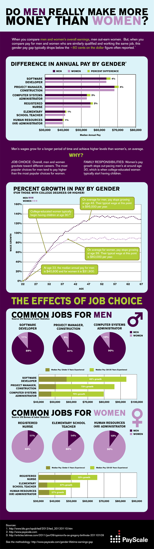
With this in mind, I went to find the methodology for the graph. I not only found the methodology, but the rest of the infographic.

As it turns out, the profession issue was directly addressed on the original....but it was completely edited out in subsequent reprints. Profession does have an effect on earnings growth, and the original captured that. I'm a little concerned about how far this graphic went without all of the important qualifying information they took care to include.
Interestingly, the NYT columnist did actually write a more comprehensive article on the topic 2 years ago that she linked to in this article, but I'm surprised she didn't do a recap. With the ease of transport of info on the web, I don't think the cut and paste job is an okay thing to do. It sets up less diligent bloggers to merely reprint, and it undermines the original work. Someone out there is quoting this right now, having no idea that they're missing 2/3rds of the information.
Bad data, bad.
Normally this is because the infographic itself is misleading, but today I found an equally hideous incarnation of this.
It all started over at feministing.com, where I was greeted with this graph:
This pretty much set off my alarm bells immediately. I had quite a few questions about all of this, as the graph obviously said very little about the methodology. Who was included? How did they account for gaps in years worked? Most importantly, did they control for profession?
I clicked on the link provided, which took me to this blog post on the New York Times website. It shows the same picture as above, with an intro of the following two sentences:
We’ve written before about how the gender pay gap grows with age. Generally speaking, the older a woman is, the wider the gap between what she earns and what her male counterpart earns.I was struck by that phrase "male counterpart". Were we really talking about counterparts here? I was curious again about the profession question. It struck me that many female dominated professions are actually "terminal" professions....i.e. the job you enter can remain pretty unchanged for years: teachers, nurses, therapists, etc. On the other hand, many male dominate professions have far more steps on the ladder, which would be a pretty non-sexist explanation for the continued growth seen throughout the decades.
With this in mind, I went to find the methodology for the graph. I not only found the methodology, but the rest of the infographic.
As it turns out, the profession issue was directly addressed on the original....but it was completely edited out in subsequent reprints. Profession does have an effect on earnings growth, and the original captured that. I'm a little concerned about how far this graphic went without all of the important qualifying information they took care to include.
Interestingly, the NYT columnist did actually write a more comprehensive article on the topic 2 years ago that she linked to in this article, but I'm surprised she didn't do a recap. With the ease of transport of info on the web, I don't think the cut and paste job is an okay thing to do. It sets up less diligent bloggers to merely reprint, and it undermines the original work. Someone out there is quoting this right now, having no idea that they're missing 2/3rds of the information.
Bad data, bad.
Sunday, May 20, 2012
When in doubt, blame the journalist: prenatal dieting edition
Sometimes bad science reporting makes me laugh, and sometimes it actually kind of stresses me out. This is one of the "this stresses me out" times.
The headline reads: Diet during pregnancy is safe and reduces risk for complications, study finds
Now aside from being a bit on the garbled side, it's a pretty provocative headline. As someone who has been in and out of obstetrician's offices for the past 7 months or so, it also runs counter to everything I've been told. According to this write-up however, here's a few things this study found:
At this point, I took a look at the original study, and found other "oops" moments in the reporting. First, the study never looked at "diets". What they actually looked at was "dietary interventions"...which they describe as follows:
Furthermore, that part about the women's weight being reduced? It wasn't. Their weight gain was reduced. ...something the study authors are clear about, but the subsequent write up completely leaves out.
I actually got a little angry about this. You can feel free to blame pregnancy hormones, but I find this sort of thing is just irresponsible. CBS is a major news network, and people are going to take what they say seriously. As the Assistant Village Idiot likes to point out, people believing faulty science on small things can be funny and doesn't matter much....but when you realize bad studies could actually affect the way people live, it gets scary. Someone following this story could do some real damage. In fact, the article does get clearer towards the end (when it quotes the original study author), but that's 6 paragraphs in. It drives me nuts that a good a carefully thought through study can get reported so sloppily and potentially dangerously. There is a world of difference between what most of us think of when we say "diet" and what the researchers here described, which was essentially just formalized pre-natal nutritional counseling.
Overall, real dieting during pregnancy is still dangerous....and can backfire in a big way. Mother's who are forced to restrict calories during pregnancy (famine victims, etc) actually wind up having children who are more likely to be obese and develop diabetes. As a side note, one of the most fascinating studies on this is the Dutch Famine Study where mother's who had temporary famine conditions during pregnancy could be studied for the long term effects on the children.
This is why it matters that the media report things correctly. People should not walk away from reading about good science with bad ideas. Words like "diet" or "weight reduction" do not mean the same thing as "dietary interventions" or "weight gain reduction". No one should have to read to paragraph 7 to get accurate information. That's just bad form.
The only thing that could have made this story worse would have been an infographic. I'm going to have nightmares about that tonight.
The headline reads: Diet during pregnancy is safe and reduces risk for complications, study finds
Now aside from being a bit on the garbled side, it's a pretty provocative headline. As someone who has been in and out of obstetrician's offices for the past 7 months or so, it also runs counter to everything I've been told. According to this write-up however, here's a few things this study found:
Is it safe for a pregnant woman to go on a diet? According to a new study, not only is it safe, but it can even be beneficial and reduce the risk of dangerous complications.That would seem to contradict what my doctor has told me....but let's read on (to what they found about dieting methods):
The researchers found that all three methods reduced a mother's weight, but diet showed the greatest effect with an average reduction of almost 9 pounds. Pregnant moms who only exercised lost about 1.5 pounds, and moms who did a combination of diet and exercise lost an average of 2.2 pounds.So they had mothers to be lose weight during pregnancy? That seems....extra wrong....but go on:
Women who went on a calorie-restricted diet were 33 percent less likely to develop pre-eclampsia, a spike in blood pressure caused by significant amounts of protein in the urine.Wait, now I know he's just phoning it in. Pre-eclampsia is not high blood pressure caused by protein in the urine, it's high blood pressure AND high protein in the urine....in fact the Mayo Clinic article he links to says so.
At this point, I took a look at the original study, and found other "oops" moments in the reporting. First, the study never looked at "diets". What they actually looked at was "dietary interventions"...which they describe as follows:
Typical dietary interventions included a balanced diet consisting of carbohydrates, proteins, and fat and maintenance of a food diary.Since this was a meta-analysis, I took a look at the references, and in fact only one study cited directly looked at caloric restriction....the sort of thing most of us think of when we hear the word "diet".
Furthermore, that part about the women's weight being reduced? It wasn't. Their weight gain was reduced. ...something the study authors are clear about, but the subsequent write up completely leaves out.
I actually got a little angry about this. You can feel free to blame pregnancy hormones, but I find this sort of thing is just irresponsible. CBS is a major news network, and people are going to take what they say seriously. As the Assistant Village Idiot likes to point out, people believing faulty science on small things can be funny and doesn't matter much....but when you realize bad studies could actually affect the way people live, it gets scary. Someone following this story could do some real damage. In fact, the article does get clearer towards the end (when it quotes the original study author), but that's 6 paragraphs in. It drives me nuts that a good a carefully thought through study can get reported so sloppily and potentially dangerously. There is a world of difference between what most of us think of when we say "diet" and what the researchers here described, which was essentially just formalized pre-natal nutritional counseling.
Overall, real dieting during pregnancy is still dangerous....and can backfire in a big way. Mother's who are forced to restrict calories during pregnancy (famine victims, etc) actually wind up having children who are more likely to be obese and develop diabetes. As a side note, one of the most fascinating studies on this is the Dutch Famine Study where mother's who had temporary famine conditions during pregnancy could be studied for the long term effects on the children.
This is why it matters that the media report things correctly. People should not walk away from reading about good science with bad ideas. Words like "diet" or "weight reduction" do not mean the same thing as "dietary interventions" or "weight gain reduction". No one should have to read to paragraph 7 to get accurate information. That's just bad form.
The only thing that could have made this story worse would have been an infographic. I'm going to have nightmares about that tonight.
Subscribe to:
Posts (Atom)