Showing posts with label Lousy Graphics. Show all posts

Thursday, July 12, 2012

Soviet Propaganda, Infographic Style

In "How to Lie With Statistics", the author frequently comments about Soviet Propaganda and how bad it is. Being a member of a cynical generation, Huff's annoyance at an oppressive regime using data skewing to seem better than it was seemed almost quaint....I mean of course they were.

Even given my cynicism and lack of Russian skills, I have to admit these infographics from the Duke U library are pretty interesting.

This one's my favorite, because none of the bar heights make any sense:
Moral of the story?  Every time you share a bad infographic, the Communists win.

Monday, July 9, 2012

Fair Market Rent and Another Dubious Infographic

I've seen this infographic a few places now, and it has been causing me some furrowed brow time:
Supposedly, this is a graphic showing how many hours you would have to work per week at a minimum wage job in order to afford a two bedroom apartment in each of the given states.  This version appears to be a year or so out of date, but here's the original report.

I had all sorts of questions about this when I saw it, so of course I went digging.  

To clarify the parameters, affordable is defined to mean 30% of income, and this chart assumes only one income earner per apartment.  Availability of low income housing or other programs is not taken in to account, which is probably where I find this chart most misleading.  Massachusetts has a fairly extensive Section 8 housing program, and from my understanding New York and California do as well.  I couldn't find a ranking for the state distribution of aid levels, but I'd wager the less affordable the state, the more they give out in assistance.

As for the fair market value rents....I couldn't find where they got their figure from.  Rents in Massachusetts vary wildly between the 3 largest city areas.  Boston rents run high....mostly because students rent most of the apartments near the colleges.  Springfield and Worcester however are much cheaper.  The MA website for Section 8 housing cites the difference between Boston and Worcester as almost $450 a month.  It appears the number used above is an average of several areas.  

If you dig further in the report however, it becomes even more interesting.  Apparently New England is the only section of the country that doesn't report whole counties when reporting fair market rates for renters, New England only reports rates for metro areas and surrounding communities.  Is the northeast really that much pricier than the rest of the country, or does their reporting just make them look that way?

While I ultimately appreciate the issue at hand with this chart, I think it would be nice to see a more comprehensive chart including states efforts to address the high housing cost.  On the chart above, NH appears slightly more affordable, but if you google "section 8 housing nh" you will find a lot of people telling you to save yourself the trouble and move to Massachusetts.  Bigger cities tend to mean higher rents AND more social programs.  Throwing them all in to one big average is not the best way of representing information in a usable fashion.

Sunday, June 3, 2012

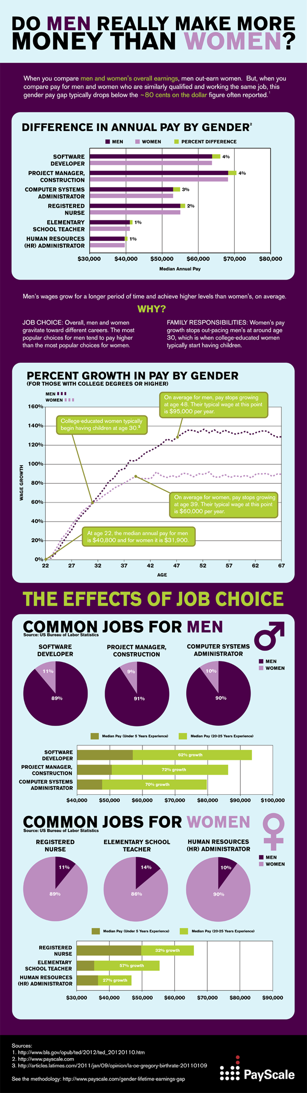
Cutting and pasting OR always check the source data

I've mentioned before that I don't like infographics.

Normally this is because the infographic itself is misleading, but today I found an equally hideous incarnation of this.

It all started over at feministing.com, where I was greeted with this graph:

This pretty much set off my alarm bells immediately.  I had quite a few questions about all of this, as the graph obviously said very little about the methodology.  Who was included?  How did they account for gaps in years worked?  Most importantly, did they control for profession?

I clicked on the link provided, which took me to this blog post on the New York Times website.  It shows the same picture as above, with an intro of the following two sentences:

We’ve written before about how the gender pay gap grows with age. Generally speaking, the older a woman is, the wider the gap between what she earns and what her male counterpart earns.
I was struck by that phrase "male counterpart".  Were we really talking about counterparts here?  I was curious again about the profession question.  It struck me that many female dominated professions are actually "terminal" professions....i.e. the job you enter can remain pretty unchanged for years: teachers, nurses, therapists, etc.  On the other hand, many male dominate professions have far more steps on the ladder, which would be a pretty non-sexist explanation for the continued growth seen throughout the decades.

With this in mind, I went to find the methodology for the graph.  I not only found the methodology, but the rest of the infographic.


As it turns out, the profession issue was directly addressed on the original....but it was completely edited out in subsequent reprints.  Profession does have an effect on earnings growth, and the original captured that.  I'm a little concerned about how far this graphic went without all of the important qualifying information they took care to include.

 Interestingly, the NYT columnist did actually write a more comprehensive article on the topic 2 years ago that she linked to in this article, but I'm surprised she didn't do a recap.  With the ease of transport of info on the web, I don't think the cut and paste job is an okay thing to do.  It sets up less diligent bloggers to merely reprint, and it undermines the original work.  Someone out there is quoting this right now, having no idea that they're missing 2/3rds of the information.

Bad data, bad.

Thursday, May 10, 2012

Some infographic love for my little brother

My wonderfully liberal little brother is having a rough week, so I thought I'd cheer him up in the best way I know how....by criticizing a Republican infographic.

He sent me this one this morning, and while it's a little sparse, the bottom right hand corner caught my eye:
Now, I have no idea how much was given to Solyndra, or how many jobs wind energy has left, but I do know a thing or two about gas prices and infographic figures.

First, those gas pumps are totally deceptive. $3.79 is almost exactly 2 times $1.85.   Fine.  However, let's look closely at those gas pumps:
I pulled out the ruler when I cropped the photo, and confirmed my suspicions.  The larger pump in the picture doubles both the height and the width of the first pump.  That's not twice as big....that's four times as big.  I'm sure they'd defend it by pointing to the dashed lines in the background and saying only the height was supposed to be reflective, but it's still deceptive.  Curious what a gas pump actually twice as big would look like?  Here you go....original low price on the left, original "double" price on the right, actual double in the middle.


Graphics aside, let's look at the numbers.

2009 was just not that long ago, and I know that $1.85 was quite the anomalous price at the time.  I've seen that stat more than once recently, and I have been annoyed by it every time.  Tonight, I decided to check my memory on it, and see if that dip really was the aberration I remember it being.  Don't remember either?  Here's the graph of average gas prices since 1978, per the BLS generator:
That dip towards the end there with the arrow?  That hit right as Obama was taking office.  In July of 2008, gas was an average of  $4.15 per gallon.  By January of 2009, it was $1.84.    I have not a clue why that drop happened, but I do know that to treat that $1.85 number as though it was standard at the time is a misrepresentation.

You can see this a bit better if you isolate George W Bush's presidency:

Now, you could accurately say that George Bush took office with gas prices at $1.53 and left with them at $1.74....but clearly that would ignore a whole lot of data in between.  

Now here's the averages and standard deviations for each term of the presidencies:

GWB - 1st term GWB - 2nd term BHO – current term
Average Gas Price 1.63 2.78 2.99
Standard Deviation 0.22 0.56 0.56


Now, none of this adjusted for inflation.  By adjusting the yearly averages to 2010 dollars, I got the second term of GWB to $2.99, and the current term for BHO to $3.00.  

You don't have to like Barack Obama, and you certainly don't have to like gas prices.  No matter what your political affiliation, I think we can all agree on one thing: ALWAYS beware of infographics.