Sunday, March 31, 2013

Church attendance and predictive models

Happy Easter, to those of you who celebrate!

I did in fact make it to church this morning, which weirdly enough got me pondering predictive models.  The connection's not as tenuous as you might think.  The church I've been going to is incredibly large...the building that is.  My best guess is it could easily hold 1000 people.  From what I've counted*, there seems to be about 100 people there on typical Sunday mornings, which makes the place seem quite cavernous.  This morning I was not able to do my normal count (I let a seven year old pick where to sit, and ended up in the front row), so I was only able to get a brief glance at the crowd.  It occurred to me that it's extremely hard to estimate the size of a crowd that is in such an outsized space, especially when that crowd distributes themselves as New England churchgoers tend to.

All of this got me to browsing around the web, looking for any data on church attendance, which led me to this article for church leaders about attendance trends.  It's a bit long, but it has some interesting research in to who goes to church and who says they go to church.  What struck me as interesting though, was point number 7, on page number 5.  If you don't feel like clicking on the link, it's a model of how church attendance in America will look by 2050 (percentage of population down, raw numbers up).

What struck me about this was what a funny thing this was to model.  In order to model church attendance, one must fundamentally presume that it is a purely sociological phenomena that is likely to trend consistently for 40 years.  While I think that can make for some interesting numbers on a screen, it actually seems to violate some assumptions most Christians themselves would hold (i.e. that there is a Divine force involved that might not work on a linear scale).  I'm not saying he shouldn't have modeled this, but it did get me thinking about what types of behavior lend themselves to modeling and which ones do not.  Some phenomena change linearly, some exponentially, some decrease/increase step-wise.  I'm not sure which one church attendance fits in to, but I'd be interested in seeing the rationale for picking one over the others.

I've had a few people send me some studies that relied on models, and I think I'm going to try to take a look at some of them this week.  This could get interesting.

*I count people during hymn singing time.  I probably started doing this when I was about 4, as far as I can recall. 

Friday, March 29, 2013

Friday Fun Links 3-29-13

Oh man, here's one that's appropriate...a gif of winter disappearing!!!

This one's personal, because this is my field.  Even if this doesn't quite live up to expectations, every weapon in the arsenal gives all of us a better shot.

This is possibly the most interesting theory I've seen on why women don't stay in STEM.  In case you're curious, using SAT scores as a measure, my math and verbal skills are identical to within one point.

This is my pick for gif of the week.

Now here's my favorite dinosaur site this week.  It might even teach mr how to say archaeopteryx correctly!


Thursday, March 28, 2013

Brain freeze

I don't have time for a regular post tonight, ironically because I spent most of my night taking a statistics midterm.  I'd make a joke about 95% confidence intervals, but I don't want to jinx anything.

Wish me luck.

Wednesday, March 27, 2013

Wednesday Brain Teaser 3-27-13

Two part question:

1. What is the next number in this sequence: 0, 1, 8, 11, 69, 88, 96, 101
2. What is the next number in this sequence: 1, 2, 5, 8, 11, 22

Tuesday, March 26, 2013

The Power of a Question

I've been spending the past few weeks working on a survey for work, and it's been some interesting work.  The survey itself took a few hours to write, the rest of the time has been attempting to reword the questions so that we make sure we're actually asking what we want to ask without affecting the respondents opinion or leading to any particular answers.  We're trying to get some data no one's ever gotten before, so we have no motivation to guide the questions anywhere in particular.

I was thinking about this when I saw this story today.  Apparently the British Humanist Society is going after the Church of England for putting out a press release that said that 81% of British adults believed in the power of prayer.  The BHS is taking issue with this because apparently this data was taken from this survey.   The question that so many people answered in the affirmative was not actually "do you believe in the power of prayer?", but rather "Irrespective of whether you currently pray or not, if you were to pray for something at the moment, what would it be for?’.  

Now that seemed like a bit of a stretch, so I looked a little further.  

It turns out that one of the options on the survey was "I would never pray for anything".  15% of people answered that, and 4% answered that they didn't know.  Thus, the accurate statement really would have been "81% of people don't say they don't believe in the power of prayer" not "81% of people believe in the power of prayer".  

I thought this was a bit of interesting story because I don't often see survey question nuances/reporting make the news, the Church of England did in fact twist the results, but the BHS did leave out the fact that there was actually a "I wouldn't pray" option.  

It's not the question, it's how you ask it.

Monday, March 25, 2013

Monday Fun Links 3-25-12

Because I didn't get to it on Friday.

This is a sad way to start the week, apparently some little girl totally had my childhood (hell, adulthood) dream come true.

In other news, are sabermetrics coming to basketball?

This is fun: book covers with more honest titles.  Gatsby renamed and shots at Howard Zinn?  Gotta check it out.

Relatedly...what Dr Suess books are really about.

If you're looking for an even shorter read, here are the 140 best Twitter feeds of the year.


Sunday, March 24, 2013

Salt over replacement

One of my favorite baseball stats to watch people figure out is the VORP, or value over replacement player.  This stat is an interesting one, in that endeavors to calculate not just how good a particular player is in respect to zero, but rather in respect to how much better the team does with the player in question as opposed to a perfectly average player from the same year.

There's a lot more to it than that, but that's not the purpose of this post.  The purpose of this post is to mention that I would LOVE a similar stat for nutrition research.  Terri put up a post about a new salt study (and gave me a very nice shout out...thanks you!), and it got me thinking about nutrition research in general.

The short version of the study is that researchers collected surveys from 50 countries, took a variety of studies about sodium contributions to disease, and created a model that purports to show how many deaths are due to excess consumption of sodium (2.3 million)

You'll notice I didn't link to the study.  That's because there is no study, at least not one that's published.  This was actually a conference paper that was presented in New Orleans at a cardiology conference.  Now this doesn't mean there's anything wrong with it.  Many researchers use conferences drum up interest/get early feedback on their research (including me).  However, this does mean much of what they did is not yet available, and the peer review process is much less stringent.

That being said, there's not much to criticize* without the details (except the headlines about it, those are awful), but it did get me thinking about the point of all of this.  I don't know exactly what countries were covered, or what the major sources of sodium  in their diets were.  It strikes me though, that for at least some of the people in these countries may not have a terrible amount of choice in the high sodium foods they're eating.  If sodium is being used to say, preserve food, or if processed (and shelf stable) foods are a big source of calories, or if salt is being used to make vegetable consumption more palatable, could campaigning to reduce it do some harm?

In nutrition research, we can't just think about what we shouldn't be eating, but also why we eat those things.  Salad dressing is a decent source of sodium in my diet, but I can guarantee I wouldn't eat as many veggies if I had to stop using it.  Does the benefit of the vegetables outweigh the detriment of the sodium?  What is the value over replacement?  When the low-fat craze hit, many people replaced fat in their diet with sugar.  A few decades later, the general consensus is that this was a bad idea.

The fundamental assumption of a study like this is that you can subtract one part of your diet separate from any other piece.  In my opinion, what we really need is a study where you at least explore that people can reduce their sodium without otherwise worsening their diet.  This critical piece seems to be missing from many nutritional public health initiatives.  It's important though...every dollar spent on an initiative to reduce sodium doesn't get spent elsewhere.  Proving something in a vacuum has to be followed by research proving it in the real world, otherwise you risk unintended consequences.   A little vice can be good for the soul.

*Okay, I'll take a shot anyway.  There's some question about how much good sodium reduction actually does, and I'm really curious how they controlled for racial differences in response to sodium levels.  


Saturday, March 23, 2013

March Madness, Data Style...or not

Well my alma mater didn't make it in to March Madness this year, but we did have a good night last night.  I caught a bit of the game, but spent most of the night watching Georgetown get crushed by a team that didn't even exist before 1997.  I normally like underdog stories, but I actually was watching the game with a rabid Georgetown alum...so it was a little awkward.

Anyway, I've been pondering the role of data in March Madness predictions this week ever since my husband got home from his March Madness auction earlier this week.  Unlike the well known "pick a bracket" set-up, the auction is a fun twist where everyone throws in $50 and then bids on the teams they want.  Payouts get progressively larger depending on how far your team(s) get.  You can get as many teams as your $50 will buy, but if you want to go all in on one team, you can go throw in more money to go higher than $50 (you can't have spent anything previously if you want to do this).   You do not get any money back if you don't spend it all.  Teams are auctioned off in random order.

This has normally been a pretty friendly competition (it's through his work), so he was a little surprised to show up to see someone furiously typing on a laptop.  He asked the guy what was going on, and he told him he'd devised an algorithm based on Nate Silver's predictions.  He had then assigned a relative dollar amount to each team, and was going to attempt to get bargains.  My husband (who of course puts up with me on a regular basis) was pretty sure he was over thinking it.

My husband's strategy has stayed pretty simple over the years: don't bid until later in the game, pick up a team you think can go all the way, and don't leave money on the table.  He won the first 3 years they did this, and has at least made his entry fee back every year, so I figure he's got a pretty good strategy.

He watched his coworker with the laptop, curious which teams he would pick.  After watching him get two low-cost-but-unlikely-to-do-much teams, he was wondering how he was going to proceed.  Suddenly the guy turned to him and said "hey, we get back the money we don't spend, right?".  "Um....no." my husband and his other friend answered.  The guy blanched a bit.

To me, this is the problem many people have with data.  The best predictions in the world are useless if you forget to learn the rules of the game.  A beautiful data set is useless if it doesn't actually help you solve the problem in front of you, and it's often worse if it sort of helps.  Harder to parse out the uselessness, more tempting to apply a flawed strategy.  How much better to always keep in mind some basic common sense.

I had an interesting discussion lately that led me to realize that my true interest, perhaps, is not actually data analysis.  A more accurate term for what I like is research methodology....the study of how to capture what you actually want to capture.  I love the analysis Nate Silver did, but I'm also impressed with my husband who made 3 key observations about this game: 
  1. People spend more money when everyone else has lots of money.
  2. It's hard to pick a winner, but easier to pick a team who will at least go to the Elite 8 and make you your money back.
  3. Money you don't spend is already lost.
Three simple ideas anyone could work out, but have somehow still made him money.  While we don't yet know the outcome, my guess is they'll work out yet again this year.  

He has the Jayhawks, in case you're curious.

Thursday, March 21, 2013

Happy Birthday to Me!

Bad Data, Bad! turns one year old today!

In honor of the occassion, please have a cupcake.
The comments and  discussions here make my day, thank you all for stopping by!


Tuesday, March 19, 2013

What's hate got to do with it?

I meant to get around to this sooner, but I was intrigued by the Assistant Village Idiot's posts from a few weeks ago about the Southern Poverty Law Center and their list of hate groups.

I've seen that phrase "hate group" tossed around a bit, and I got curious about the precise meaning.  It seems like one of those terms that most people have a gut reaction too, but surely there must be an actual definition somewhere?  After all, the Whitehouse.gov petition to get Westboro Baptis Church labeled a hate group has almost 350,000 signatures....surely it must mean something?  

Well, as far as I can tell, not really*....or at least not one that carries much action.

While "hate crime" has an extremely specific definition and is of interest to the FBI, the FBI clarifies that they do not prosecute groups, only people.  When asked if they track hate groups, the FBI's website says this:
Does the FBI investigate hate groups in the United States?   
The FBI investigates domestic hate groups within guidelines established by the attorney general. Investigations are conducted only when a threat or advocacy of force is made; when the group has the apparent ability to carry out the proclaimed act; and when the act would constitute a potential violation of federal law.
So the US government doesn't really declare anything a hate group, but it will investigate threats by groups.  I'm not really sure what the petition was about then, as it seems to me Westboro Baptist has always managed to stay on the right (if awful) side of the law (unsurprisingly, the leader's a lawyer).  There seems to be some impression that getting declared a hate group would force them to lose their tax exempt status...but that seems unlikely given that there's no legal definition.

So if the government doesn't track these things, what about the Southern Poverty Law Center?  What standards do they use?  From their website:

All hate groups have beliefs or practices that attack or malign an entire class of people, typically for their immutable characteristics.
Hate group activities can include criminal acts, marches, rallies, speeches, meetings, leafleting or publishing. Websites appearing to be merely the work of a single individual, rather than the publication of a group, are not included in this list. Listing here does not imply a group advocates or engages in violence or other criminal activity.

Also interesting was their list of 15 different ideologies that they classify hate groups with:  Anti-Gay, Anti-Immigrant, Anti-Muslim, Black Separatist, Christian Identity (an anti-Semitic group), Holocaust Denial, Ku, Klux Klan, Neo-Confederate, Neo-Nazi, Patriot Movement, Racist Music, Racist Skinheads, Radical Traditional Catholicism (rejected by the Vatican), Sovereign Citizens Movement, and White Nationalist.

Interestingly, they actually release their rationale for adding individual groups to their list in their newsletters.  For example, what it takes to be considered an anti-gay hate group vs a group that believes being gay is wrong:
Generally, the SPLC’s listings of these groups is based on their propagation of known falsehoods — claims about LGBT people that have been thoroughly discredited by scientific authorities — and repeated, groundless name-calling. Viewing homosexuality as unbiblical does not qualify organizations for listing as hate groups.
Interestingly, it appears Massachusetts has 8 listed hate groups, only 4 of whom I'd heard of.  I also kind of had to wonder if any Sovereign Citizens were included on the map, or if they all got listed under their own countries.  Sorry, couldn't resist that one.


*In one of those weird issues that drives me nuts, every source I found that cited the "FBI definition of a hate group" pointed to the same document....one that never once gave the quoted definition.  This totally weirds me out when it happens.  My guess is it started with the Wikipedia article.  ALWAYS READ THE SOURCE DOCUMENTS.  

Monday, March 18, 2013

Friends don't let friends dance and derive

I was going to write a post on the SPLC tonight, but my throat seems to have caught fire and my sinuses appear to be attempting an evacuation....so instead please enjoy this video of math majors dancing:

I can't even imagine what these kids are gonna do when they get around to convolving.

Sunday, March 17, 2013

Irish in America

Happy St Patrick's Day!

I've got some pretty good Irish heritage going on in my house.  In fact, I'm the least Irish member.  The dog is actually an Irish immigrant, the husband's completely Irish.  The little lord has more than me, and (in the words of my mother) I'm a mutt...albeit a mutt with a good helping of Irish.

Anyway, living in Boston I tend to forget that Irish heritage is not ubiquitous in the US.  I found this map that shows that my skewed vision is at least somewhat justified:
It appears I do actually live in a place where Irish heritage is more prevalent.  Then I saw this map:
So not only do I live in a region that's heavily Irish, but I apparently have spent the past 10 years in zip codes that were 30% Irish or more.  

Always interesting to explore your own potential perception skews.

And speaking of perception skewers, who's up for an Irish car bomb? How about in cupcake form?


Friday, March 15, 2013

Friday Fun Links 3-15-13

First and foremost, beware the Ides of March.

Ever wanted to see what Kurt Vonnegut looked like in high school?  Here you go!

Now the important stuff....how to pick the best seat at a restaurant or dinner party.  Read this so things like this won't happen.

Now more unimportant stuff....how to make a cat avatar.

Now that we know how to make cats, why not make the cast of Game of Thrones?

I'm happy that's coming back soon.

Thursday, March 14, 2013

More pi anyone?

I should have clarified in post earlier today, that I was only wishing everyone a happy American Pi Day....or any others who use month/date/year convention.

For those of you using date/month, we'll see you back here on April 31st.

For those of you preferring fractions, we'll see you on July 22nd.

For those of you who try to make things universal by writing things like 14MAR13, y'all just screwed yourselves out of a holiday.  You're not invited to my mole day party either.

So basically you can justify celebrating 3 different types of pi days.  I think that's excellent.  I like pi.

Happy Pi Day!


It occurred to me this morning that in two years, pi day is going to be REALLY cool.

Wednesday, March 13, 2013

Wednesday Brain Teaser 3-13-13

I'm falling behind in mentioning correct answers, so today I'm giving both a problem and an answer....two in fact.  Pick which one you thought of first.

6÷2(1+2)=?


Think about it. 


 Think about it.


Apparently the answer's been a little controversial.

Tuesday, March 12, 2013

Sugar (oh honey honey)

Last week reader panjoomby pointed me to an interesting study that correlated a countries sugar consumption to their rates of major depression.  Apparently that gives a correlation of .948.

Any time there's a correlation that high, I'm going to get a look on my face that's an interesting cross between curious and suspicious and that causes me to get wrinkles between my eyebrows.  I decided to take a look around for the full study, and found a copy here.  Basically the authors took data from the Food and Agricultural Organization  and correlated them with the results from a 1996 paper by Weissman et al published in JAMA called Cross-national epidemiology of major depression and bipolar disorder.

I couldn't find a full free version of the mental health study, but I did find this update by the original author where she described what the study did (they surveyed people in the various countries for symptoms matching those for major depression, DSM III version)

A few things struck me about this study and it's near-perfect correlation (shown below):

  1. Only six countries were used for the correlation.  The original study on depression, they studied 10 countries:  Canada, U.S., Puerto Rico, France, Italy, West Germany (it was 1991), Lebanon, Taiwan, Korea, and New Zealand.   They clarified that Taiwan and Puerto Rico had no sugar consumption data.  Ultimately, their line consisted of Korea, France, Germany, US, Canada and New Zealand.  West Germany and Lebanon were not mentioned.  West Germany I presume something about it not existing any more, but Lebanon concerned me, as it was suggested it had very high rates of depression.  When I pulled my own data from the FAO, it looked like Lebanon's sugar consumption was similar to Canada's.  That would have change things a bit.
  2. The country anchoring the bottom of the line is dramatically culturally different from the other 5 countries.  When I got my degree, I actually had to take an entire class on culturally sensitive counseling.  In it, we were reminded how many mental health standards were written either by North Americans or Europeans and how they really didn't fit some cultures very well.  Asian cultures are notorious for under reporting symptoms, and for giving different names to things to avoid stigma.  This was admitted by the authors to be a weakness, but looking at the chart makes you realize this correlation would not be nearly as good if Korea wasn't in the mix.
  3. The only source of sugar they counted was sugar.  The FAO reports honey consumption.  And lots of fruits and date consumption.  I get why you wouldn't throw fruit in there, but it seems to me that there are a few other sweeteners that might change the numbers.    Any hypothesis that posits that processed cane sugar can cause dramatic mental health issues should probably ponder what (if any) effect a different type of sugar could have, and if adding it in changed anything.  I mean, they mentioned dates in their first paragraph for heaven's sake.
  4. Every country on this list has to have a certain level of infrastructure to consume sugar and to be survey for depression.  Sugar tends to be more abundant in countries that have more food.  Countries that have more food tend to be better for researchers to set up shop in.  Countries without either are not included.  There's some suggestion that quite a few poor countries might have really high depression rates thanks to malnutrition and otherwise terrible conditions.  That would definitely skew the line, and raise more questions about poverty rates in the originally studied countries.
None of this should imply that I'm a big fan of sugar.  I'm not.  I don't tolerate it well.  If you'd like to see an example of what I look like when I eat it, please see below:

Monday, March 11, 2013

DON'T PANIC

Douglas Adams would have been 61 today.

As someone who still envisions the words "DON'T PANIC" in large friendly letters every time I get myself in a dicey situation, I thought I'd throw a few of his more memorable quotes out there for you, complete with when I tend to use them in my every day life:

Quote I say (at least in my head) every time I have flown, ever:
"It can hardly be a coincidence that no language on earth has ever produced the expression “As pretty as an airport.”

Quote I ponder when watching people on public transportation:
"There is a theory which states that if ever anyone discovers exactly what the Universe is for and why it is here, it will instantly disappear and be replaced by something even more bizarre and inexplicable.There is another theory which states that this has already happened."

Quote I think of when I'm lying on the couch and realize I'm thirsty but my water is in the dining room:
"Space is big. You just won't believe how vastly, hugely, mind-bogglingly big it is. I mean, you may think it's a long way down the road to the drug store, but that's just peanuts to space."

Quote I think of most often when I'm tripping over something or falling down stairs:
"There is an art, it says, or rather, a knack to flying. The knack lies in learning how to throw yourself at the ground and miss. … Clearly, it is this second part, the missing, which presents the difficulties."

Quote I feel best describes my adolescence:
"A learning experience is one of those things that say, “You know that thing you just did? Don’t do that.”

Feel free to add your own favorite quote in the comments.


Sunday, March 10, 2013

Hey good lookin'

Confession time:  back in 2006, I tried online dating for a few months.  It was a stricter site...one where you had to be matched with people before you could see their information, and I figured it couldn't hurt to try.  I never actually met up with anyone I met there (met my husband through friends before it got to that point), but I had some interesting revelations before I quit.  For most of the time, my main profile picture was a kind of funky/artsy photo a friend had taken of me from a distance.  I liked the picture quite a bit, so I didn't think twice about putting it up.  About a week before I quit the site however, someone took a picture of me that was also cute, but it was just of my face.  I decided to put it up as my main picture, not thinking much of it.

I don't think I checked the site again for a few days, but when I got back to it, I found I'd gotten quite the influx of messages.  Some of them were from guys who had access to my profile for a month.  I had unintentionally stumbled on to a truth of the online dating world: picture type matters.

I was thinking of this when I got forwarded this story from the WSJ best of the web column with the subtitle "The average woman has average looks, the average man is unsightly".  It's a take on this 2009 OkCupid blog post that shows that OkCupid users rank women on a normal distribution, and men on a right skewed distribution (the dotted lines show the ranking, the solid lines show how many messages they get):
Now, there's some really interesting stuff going on here, some of which both articles touched on....but there's a few things I'd like to highlight:

  • Neither article acknowledged the possibility that the average female user of a dating site might actually be more attractive than the average male user.  Repeat after me: this is not a random sample.  This is not a random sample.  This is NOT a random sample.  Everyone who puts up a profile was self selected.  You'd need a study on a random population before you could determine that women were harsher in their ratings.  People sign up for dating sites because they want something more than is available in their daily life.  If a highly attractive 30 year old male and 30 year old female were both considering signing up, the 30 year old female would likely have considerations around the biological clock issue that would push her to sign up faster than the 30 year old male.  Some people still see online dating as stigmatized, so pressure matters.
  • Are the women really more attractive, or do they just pick better pictures?  In the story I kicked off with, I mentioned that the picture mattered.  I was (obviously) the same person in both pictures, and they were taken 2 months apart...and yet it seems likely by my response rate that men would have rated my appearance differently in the two photos.  When academic studies look at how we rate attractiveness, they generally control for this by providing uniform head shots.  In the OkCupid post, they show examples of "average" women and men.  The average women appeared to have tried harder with their photos.
  • Men might have a more refined rating system. A few months ago I saw a link to a study that suggested that women had a more finely tuned rating system for humor than men.  The link had some sort of comment with it about how it was trying to make men look bad, but I read it differently.  We're always hearing that women aren't as funny as men because men use humor to attract a mate.  Thus it would only make sense if women had the better rating system.  It's being used on them.  Men would not need a well refined rating system...they're the ones using, not assessing.  Same thing here.  The OkCupid stats showed that men message the most attractive women 11 times more often than the least attractive ones, for women's messages it's only 4 to 1.  If ratings matter more to men, they'll have developed more nuance (ie the 2-4 range will have more meaning).  Anecdotally, my male friends almost always include a rating of whatever girl they've most recently met ("she's a total 9/dimepiece/HB8").  My female friends seem more binary.  Either he's attractive enough for them or not.
Anyway, those are my thoughts.  Well, not all my thoughts.  After reading about dating sites all morning, my most pronounced thought was "Gee I'm glad I'm married, this looks like a lot of work."  Love you honey!


Friday, March 8, 2013

Friday Fun Links 3-8-13

Do you feel like getting away?  Got your passport handy?  How about those in other states?

Here's some really pretty artistic gifs that kind of made my day.

Other amusing moments of the day include 17 kids who will change the world.

I guess I'm in a "kids are fun" mood today because I also liked this:


Thursday, March 7, 2013

And I, I will survive...maybe

Cancer Treatment Centers of America came under some serious fire today for their reporting practices around survival rates of their patients.  For those unfamiliar, CTCA is a for-profit cancer treatment center that advertises heavily on TV about their high survival rates and has multiple locations throughout the US.

The accusation of data manipulation include:
  • Not accepting patients whose prognosis is too bleak so that their death won't count in their stats
  • Encouraging Medicare and Medicaid patients not to come there (approximately 14% of their patients are Medicare, your average oncology center is 50% Medicare)
  • Targeting richer patients whose added resources, better overall health and (likely) earlier detection will lead to better survival all on their own
  • Excluding large portions of the patients they do treat from their data
  • Reporting survival rates in terms of 4 year survival, not the industry standard 5 year survival
The charges are heavy, especially because the higher than average survival rate is a cornerstone of their advertising.  I took a look at one of their survival rate pages, and it does indeed only go through year 4, rather than the standard 5.  It also appears that they toss any patient who got any care anywhere else ever in the course of their diagnosis, and more strangely "excluded any patient whose medical records had missing information".*  This left them with only 45 people to calculate prostate cancer survival rates from.

Apparently, CTCA has heard the criticism and is recalculating some of their stats:

Xiong said he is doing new survival calculations using more recent data from CTCA, trying to make sure the comparison to the national database is rigorous. The new results, Xiong said, are expected to be posted on CTCA's website this month. 
For some cancers, CTCA will still have better survival rates, he said. For others, "the survival difference in favor of CTCA is no longer statistically significant" after adjusting for several differences between CTCA's patients and those in the national database.
Now, I've talked before about hospital ranking and how difficult it is, but this story really got to me.   We're living in a time in the US where hospitals are under increasing scrutiny to lower their costs, and rightfully so.  However, in our effort to achieve the triple aim (right treatment, right time, right price), we have to make sure we're working honestly.  Increasing survival rate through innovation is awesome, increasing survival rates by only treating the population most likely to survive is atrocious.

This is why many hospitals are reluctant to release their statistics.  It's easy to skew things if you try, and it's even harder for the public to understand what this skewing means.  In education, teacher often complain their now "teaching to the test".....do you really want a doctor who's "treating for the stat"?

*Interestingly, when my workplace talks about our survival rates, we actually have a "lost to follow up" category we add in.  I'm curious what those numbers would be here....since I'm assuming that's what "missing medical records" means.  Why not release the numbers of how many that is?  

Wednesday, March 6, 2013

Wednesday Brain Teaser 3-6-13

A Greek was born on the 260th day of 20 B.C. and died on the 260th day of 60 A.D.  How many years did he live?

Tuesday, March 5, 2013

Neurobunk and how to properly blame a journalist

"When in doubt, blame the journalist" is one of my favorite explanations for bad science.  So often the science behind the headline is actually good (or at least appropriately admitting of it's shortcomings) and then a journalist comes along and mucks it all up.  I've often wondered how scientists feel about seeing their work so grossly misrepresented, and yesterday I stumbled upon this TED talk where a neuroscientist explains how it felt to see that done to her own work:


It's a good video, but if you don't have time for it, here's the low down:  Molly Crockett and her lab did a study on whether or not taking away tryptophan from the brain would result in worse decision making.  They did this by giving people a gross drink.  The headlines ended up blaring "eat cheese for better decision making".  Apparently the fact that cheese contains tryptophan was enough for the writers to conclude that eating cheese would cause decision making getting better....something the study never claimed to say.

The rest of her talk is quite good.  Some interesting points:

  • People are more likely to believe scientific articles that have pictures of the brain in them
  • Most regions of the brain have multiple functions, so any study claiming that the area associated with a specific emotion lit up at stimulus x likely just picked the function of that part of the brain they liked best 
  • Oxytocin not only promotes good feelings (like is commonly reported) but also jealousy and bad feelings
I don't know much about neuroscience, so I enjoyed seeing new ways of cutting through the hype.  

It also led me to this article from a few months ago, which is also good.

Monday, March 4, 2013

Will the real racist please stand up?

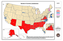
For those of you who don't follow the activities of the Supreme Court, you missed a good one last week.  Shelby County v Holder went up before the judges, and Scalia, Roberts, Sotomayor and Kagan all got in some commentary that made headlines.   The case is a challenge specifically to Section 5 of the Voting Rights Act, which requires that states with a history of discriminatory practices in voting must get any changes to their voting practices "precleared" before they can implement them.  

Other states, like the one I currently reside in, can change their practices willy-nilly, and then just get sued later under section 2 of the Voting Rights Act, which all states must uphold.

Shelby County is arguing that Section 5 infringes on states rights by holding some states to a different standard based on past history.  As of 2008, here's who's on the section 5 list:
Now I'll admit I wasn't following the case all that closely, but my Dad and I talked about it briefly this weekend, which led him to send me this link.  Apparently part way through the arguments, Chief Justice Roberts queried why Mississippi needs special clearance when Massachusetts has a lower percentage of registered black voters and lower turnout rates than Mississippi does.  There's been some bickering over whether the stats he used to back him up are valid or not (short version: given the margin of error they could be wrong, but it's not overly likely), but that's not what I wanted to talk about.  

What I wanted to talk about was how in the world a state goes about proving they're not racist in their voting practices.  

This is a tough question.  Voter turnout is a funny thing....it's typically low enough that the environment in which the vote is taking place can actually make a difference.  Here's a few things you'd have to consider when assessing how many people in a particular :
  1. Which elections are we counting?  The census data Chief Justice Roberts was citing was from this lower court decision, which clarifies this was from the 2004 election.  I would like to see some more robust data that shows where these numbers go when it's not a presidential election.
  2. What/who else was on the ballot in the individual states in the year the data was pulled.  Some issues just effect certain groups more.  We should really at least attempt to tease out if there was any significant differences in ballot measures/state level races in 2004 before comparing the numbers.
  3. Does it matter more who votes, or how much it took to get there? Voter turnout's a funny thing...sometimes the more hurdles in people's way, the more dedicated they get.  If two states have identical turnout rates, it wouldn't always mean that it was equally easy for people to get to the polls. At no point in any of these decisions did I see an attempt to assess how easy/difficult people felt it was to vote.
  4. How many laws have they tried to pass but not been able to? When looking at who votes, it's important to remember that those votes were cast using the setup of laws actually implemented. Sotomayor mentioned the first day that Shelby County has had 240 laws blocked under Section 2, and as I noted above, Massachusetts has tried to pass laws that did not hold up in court.
  5. Can we separate the effect of race from the effect of socioeconomic status? I voted in urban precincts for a number of years.  They can be terrible.  
  6. How are other minorities doing? I mean I get why the focus is where it is, but doesn't it matter how other races are doing to?
So those are my thoughts on how you'd start to assess racism in elections in a meaningful way.  Other facets the court cited but I didn't comment on included proportion of black elected officials (which I put less credence in because if the minority population isn't even distributed throughout the state this skews easily) and the number of observers the federal government has sent to monitor elections (a circular argument the court admits, the federal government sends people where it thinks there's a problem, you shouldn't then use that to prove there's a problem).

To be clear, this is more a thought experiment on how you would assess state by state racism than any commentary on what should happen with the Voting Rights Act.  I've also never been to Mississippi, and thus will withhold any judgment on the level of racism there in comparison to my state.  I have enough trouble figuring out where the heck I'm supposed to show up to vote in general (I've moved a lot) to have any idea if our voting policies are good, bad, or indifferent.  


Friday, March 1, 2013

Friday Fun Links 3-1-13

Hey!  Happy Friday! In celebration, I think it's time you ask the internet "Am I Awesome?"

I mentioned that in Salt Lake City I rekindled my love affair with dinosaurs.  Thus, this Tumblr makes me happy.

This also makes me happy: the most obscenely titled peer reviewed paper you'll see all day.

Also from io9, the scientists that would make the best superheros.

I know I'm feeling pretty burnt out on politics, but this site is pretty cool....locate your state level representation, and get the bills they sponsor, committees they serve on, and other such fiddle faddle.