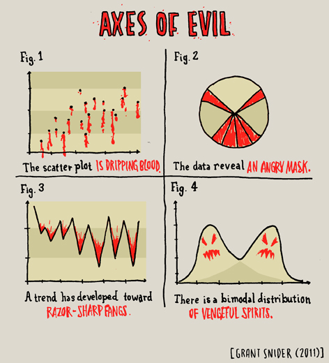
Thursday, June 28, 2012

Big day

To be honest, my day was dominated by big news that had nothing to do with healthcare.....we closed on our house today (the one we were buying....we closed our sale yesterday).  

I was fairly glad, as I got sick of the coverage of the decision by noon.  

I thought the coverage itself had some interesting things to say about how we process data however.  When it comes to science, so often people are just skimming over things, trying to get out a good headline.  Watching the blogs and other websites today, I saw a different angle....people trying to dissect legal jargon quickly to get to the sound bite....which of course led to this:

It was almost nice watching this happen in a different field....though I felt incredibly bad for the pundits trying to put together commentary while still trying to read the decision.

Not much with statistics to comment on, though Nate Silver has some good preliminary stats on how this will go for the election.  

Wednesday, June 27, 2012

Conspiracy theories and replicatability

I'm working on a theory around how many conspiracy theories a reasonable person is allowed to buy in to in their lifetime while still being completely normal.  My current thought is you're allowed at least 3 during your teenage years, and then one every 5 - 10 years after.

When I say conspiracy theories, I will mention that I'm only including ones that do not actually change your daily life in a significant way.  

Conspiracy theories in general are a fantastic study of selective data interpretation.  All of them do it in different ways, but there are some general themes.  One of them was illustrated quite entertainingly by xkcd.com this morning:

To note: I never disbelieved the moon landing, but my (normally rational) little brother did for about 3 weeks one summer after watching a documentary on TV.  He's now a high school science teacher, for what it's worth.

Tuesday, June 26, 2012

Causes of death and perception skewing

My first job out of college was working in one of the busiest Emergency Departments in the country.  I learned a lot of interesting things about human behavior there, and some random facts about the way the ED interacts with the government as far as reporting goes.  

One of the smaller parts of my job was making sure the proper reports got filed at the appropriate times, and this included death certificates.  Contrary to what you might think, not many people actually die in the Emergency Department.  Trauma victims almost always have enough time to get to the operating room before they die, and people with more chronic illnesses tend to die in the intensive care units.  Thus, when death certificates come up, most residents have no idea how to fill them out.  I don't remember much about them, but I will always remember one thing: heart failure is NOT a valid cause of death in Massachusetts.  You can put unknown, or heart disease or many many other things, but you can't put heart failure.  The reason?  Everyone dies of heart failure.  If your heart is still beating, you're not getting a death certificate.  

I'm thinking of all this because of a very cool new interactive graph put out by the New England Journal of Medicine about causes of death over the years.  I can only post the static graph, but I suggest you check out the interactive one:
Another list here, comparing 1900 and 2010 directly:
It's interesting to see causes that have dropped due to actual dips (tuberculosis) and those that are not there any more due to medical reclassification (senility).

It's a good study in how medical reporting can change over time for various reasons, and why changes should always viewed from both a broad view as well as up close.

Monday, June 25, 2012

Arizona Immigration and fake statistics

In case you haven't heard, the Supreme Court ruled on Arizona's immigration law today.

I was not surprised to see this show up on some of the feminist blogs I read, as they generally have a pro-immigration slant, but I was more than a little surprised to see that Amanda Marcotte considers this a women's issue.

In a blog post for the XX blog on Slate.com, she argues that the laws surrounding checking IDs will likely result in racial profiling (certainly) and probably target the young (highly likely) but that this will also target women more than men (wait, huh?).

Her reasoning:
.....women, especially in poor or rural communities, are also much more likely to be out and about without legal identification than men, especially if they don't drive or drive often. Women that are poor or undereducated are much more likely to be stay-at-home mothers with few resources, which makes it very easy to let concerns about up-to-date licenses or ID slip, especially if you don't drive a car much because someone else in the household is using it for work. If your daily life is dedicated to running errands for your family, you may not have much cause to worry about keeping all your papers in order generally, until it's too late and you're finding yourself in jail for not being able to prove citizenship on the spot.
A few comments:

  1. I have searched for 20 minutes for any study or proof that women leave the house without their ID more often than men.  I can't find it.  Maybe the idea is that women walk around more than men?
  2. Women that are poor and undereducated are not more likely to be stay at home mothers.  56% of SAHM have at least some college education or more.
  3. I can't find any hard data on which gender lets their license expire more often, but I also can't find proof that it's women.
I hate statistics based on bad data, but I really hate statistics just pulled from thin air.  Some assertions are self evident for sure....I don't know that many people would argue that a group of teenage boys out on a corner is more likely to be stopped by the police than a group of 70 year old men....but the paragraph above states quite definitively several things that don't seem at all definitive.  I could be wrong, but there weren't any sources attached to check with.  When you factor in the idea that men are probably more likely to be stopped than women, it's hard to figure out where this particular point is coming from.

If you disagree with Arizona's law, that's fine....but don't make up statistics about it's impact on women to justify that.  If it's wrong, it's wrong because it impacts people in general, not women in particular.

Sunday, June 24, 2012

Life goes on, and so does life expectancy

Life expectancy is a funny thing.  It's a pretty often quoted statistic that not many people realize is just that - a statistic.  It's also fairly misunderstood, in that many people presume it's static.

Truthfully, your life expectancy changes over the course of your life based on how long you've already lived. Most people accept this as making sense once it's pointed out, but it's not often the first thought people have when they here it (and journalist's are ABYSMAL at clarifying the "at birth" part of most life expectancy estimates).  Anyway, this week chartporn.org posted this chart, which I think illustrates the changes nicely.  I didn't check all the other data they put on there (though I was surprised to see how low the median age for first divorces is), but I thought the overall affect was quite informative.

In particular, I like the beginning of the chart, where it shows that if you make it beyond your first year, you actually get a bump up pretty quickly.  Infant mortality is not often thought of as affecting overall life expectancy in developed countries, but it does.

Friday, June 22, 2012

Friday Fun Links 6-22-12

Why ignorance shouldn't be a dirty word.

I think this article's premise should be someone's doctoral thesis.

I've never used Pinterest, but this version of it seems to have potential.

Work got you down?  Don't try robbing banks.  It's not as lucrative as it would seem.

Since that's out, perhaps you should go on a road trip.  Weather.com has a trip planner that will show you weather for your route.

This may not be as interesting to you as it is to me at the moment, but Chris Mulligan put up this very cool graph of birth trends by day of the year:

It looks like the data used is from 1969 to 1988....I would have loved to see this graph for 100 years ago, before there were any c-sections or inducements to contend with.  I had a Coptic Egyptian roommate at one point, and she told me that when she was little, they couldn't divide up kids by birth date when they went to sort people out.  Apparently Coptic's are prohibited from having sex for almost 170 days out of the year, and so the babies are all born very clustered together (9 months after the end of Lent for example).  I'd imagine the data would be nearly impossible to get a hold of, but I'd love to see some cultural variations on this to see how things correlated with social norms.

Thursday, June 21, 2012

More thoughts on the soda ban

Yesterday I found out the soda ban is potentially hitting a bit closer to home.

For those of you not familiar with Cambridge, MA, it's affectionately known as "The People's Republic" (and even has a communist bar of the same name).  Thus the proposed ban was pretty unsurprising.

Coincidentally, Ben Goldacre put up a new post yesterday publicizing a paper he coauthored to try to push governments in the UK to actually conduct trials of their policies before implementing them.

Best quote:
We also show that policy people need to have a little humility, and accept that they don’t necessarily know if their great new idea really will achieve its stated objectives. We do this using examples of policies which should have been great in principle, but turned out to be actively harmful when they were finally tested.
Contrast this to the Mayor of Cambridge's statement on the soda ban:
"As much free will as you can have in a society is a good idea," Davis said Tuesday. "... But with a public health issue, you look at those things that are dangerous for people, that need government regulation."
Is no one interested in finding out if this idea will actually work before implementing it?  The leading researchers in the field seem to think it won't.   I tend to agree with them.  You know what though?  I'm game.  Let's put it to a randomized trial.  There are those who think the constitutionality of this should be worked out first, but I think a well run trial could open the door for an opt in system rather than a mandatory one.

Hey, maybe if politicians stayed a little more open to testing their ideas, you wouldn't wind up with cartoons like this one:

Wednesday, June 20, 2012

Quote of the Week

Another thing I must point out is that you cannot prove a vague theory wrong. If the guess that you make is poorly expressed and rather vague, and the method that you use for figuring out the consequences is a little vague - you are not sure, and you say, ‘I think everything’s right because it’s all due to so and so, and such and such do this and that more or less, and I can sort of explain how this works'...then you see that this theory is good, because it cannot be proved wrong! Also if the process of computing the consequences is indefinite, then with a little skill any experimental results can be made to look like the expected consequences.                                      -Richard Feynman                                                                                                          “The Character of Physical Law”  1992  pp.158-159
I feel this quote should be a mandatory back drop for every political speech given, especially in election years.

Tuesday, June 19, 2012

Does race or profession affect sleep?

I've commented before on my skepticism about self reported sleep studies.

Two recent studies on sleep piqued my interest, and while my original criticisms hold, there was yet another issue I wanted to bring up.

The first was from a few months back at the NYT blog, commenting on the most sleep deprived professions.
The second is from Time magazine, and talks about sleep differences among the races.

My gripe with both studies is the extremely small difference between the rankings.

In the professions study (sponsored by Sleepy's btw), the most sleep deprived profession (home health aide) clocks in at 6hr57m.  The most well rested is loggers, with 7h20m.   On a self reported survey, how significant is 23 minutes?

From the study on races:
Overall, the researchers found, blacks, Hispanics and Asians slept less than whites. Blacks got 6.8 hours of sleep a night on average, compared with 6.9 hours for Hispanics and Asians, and 7.4 hours a night for whites. 
Here we see the same thing....there's a 6 minute difference between the totals for Blacks and Hispanics and Asians.   Whites get 30 minutes more than Hispanics/Asians and 36 minutes more than blacks.

I question the significance of this, since I can't remember whether I went to bed at 9:00 or 9:30 last night, and would have to guess if someone asked me.  Both surveys state this was self reported, and thus the chance these averages could be even closer together is huge.

Additionally, these differences do not actually reach the level of significance that the studies showing the dangers of sleep deprivation reach.

For example, in this study about sleep and overeating, subjects were woken up 2/3rds of the way through their normal sleep time.  That would be 2 hours early for nearly everyone above.  The studies on heart disease were only linked with chronic insomnia.  Cancer and diabetes are both more common in shift workers, but as someone who worked overnights for 3 years, I can tell you that's not the same as waking up 30 minutes early.

Kaiser Fung has a great post about the popularizing of tiny effects that will be a hit if you didn't like Freakonomics.

Monday, June 18, 2012

Stats and Father's and Father's Day Stats

I spent most of yesterday driving back from somewhere on the Pennsylvania/Maryland/West Virginia border, so I didn't have time to do a proper Father's Day post.  I did call my dad though, so I guess I get half credit.

I wanted to do a post for my father, because he's pretty responsible for my love of stats.  If someone uncovers a stats gene some day, I got that from him too.  He's the only other person I know who truly finds numbers and stats a great way to unwind.  He's also the first person who I ever remember telling me to be more careful about how I read research.

As I recall, I was probably about 13 or 14, and someone had just told me that those from lower socioeconomic classes tended to score lower on the SATs.  I repeatedly this to my father, as I was outraged as only a teenage girl can be.  My father stopped me immediately and started explaining to me that socioeconomic status is not random, and therefore this may not be as bad as it looked.  College educated people would be likely to earn more and to also have children more likely to perform well on the SATs.  Whether this was a product of genetics or a general household emphasis, both nature and nurture would likely be stacked in favor of higher incomes.  We then had a nice long talk about school districts and testing bias, but he cautioned me strongly to remember that even if those situations were made perfectly equitable, higher income kids would like still score higher.  

It's not often that a single conversation changes your outlook so completely, but that one did.  Here we are a decade and a half later, and looking for faults in studies is still a good chunk of what goes through my head on a daily basis.  Luckily for me, I had lots of people in my life who valued truth and intellectual integrity over agenda, but my dad is the first one I remember pushing this in a way that stuck.  

My Dad is the best example I have of someone who would actually repeat or acknowledge research that contradicted his own personal beliefs.  He taught us that a win doesn't count if you have to distort the truth to get there.  I am eternally grateful for my Dad, and all the things he added to my life, statistically and otherwise.

To show my thanks, Dad, here are some numbers for you:

These show how important it is to have a dad.  
This is some census data about dads in America.
Here's a link to the Sabermetrics for the current Red Sox team.

So happy Father's Day dad, I sincerely hope that your emotional and mental state were at least one standard deviation above the median on a normalized scale.  Preferably two, even when adjusted for weekend vs weekday averages.

Sunday, June 17, 2012

Soda bans and research misapplications

When I first read about Mayor Bloomberg's proposed soda restrictions for NYC, I immediately thought of this post where I mentioned the utter failure of removing vending machines from schools.  Thus, I was extremely skeptical that this ban would work at all, and it seemed quite an intrusion in to private business for what I saw as an untested theory.

To be honest, I didn't put much more thought in to it.  I saw the studies about people eating more from large containers floating around, but I dismissed on the basis that (like with the vending machine theory) they were skipping a crucial step.  Even if this ban got people to drink less soda, that doesn't actually prove it would reduce obesity.  You have to prove all the steps in the series to prove the conclusion.

A few days ago, the authors of the "bigger containers cause people to eat more" study published their own rebuttal to the ban.  In an excellent example of the clash of politics and research, they claim that to apply their work on portion sizes in this manor is a misreading of the body of their work.  They highlight that the larger containers study was done by assigning portion sizes at random, to subjects who had no expectations as to what they would be getting.  In their words, the ban is a problem because (highlight mine):

Banning larger sizes is a visible and controversial idea. If it fails, no one will trust that the next big -- and perhaps better -- idea will work, because "Look what happened in New York City." It poisons the water for ideas that may have more potential.
Second, 150 years of research in food economics tells us that people get what they want. Someone who buys a 32-ounce soft drink wants a 32-ounce soft drink. He or she will go to a place that offers fountain refills, or buy two. If the people who want them don't have much money, they might cut back on fruits or vegetables or a bit of their family meal budget.
In essence, by removing the random element and forcibly replacing what people want with something the don't, you frequently will have the worst possible effect: rebellion.

Mindless eating can be a problem, but rebellious eating is even worse.

When the researchers you're trying to use to back yourself up start protesting your policies, you know you got it all wrong.

Thursday, June 14, 2012

It's all (culturally) relative

Last week I put up a post regarding a study on sexism levels in men whose wives stay at home.  I argued that due to the diversity of that group of men, and the variety of reasons a woman might stay home, this study was essentially meaningless.

Another issue came up in the comments section that I wanted to touch on: cultural relevance of data.

Most studies that get press here in the US are from the US, performed on American subjects.  This is sketchy business.

In the study about stay at home moms, mothers who worked part time were lumped in with the stay at home mothers.  Interestingly, in the Netherlands, this would actually be 90% of the women.  Does that mean that nearly every Dutch man married to a woman is more likely to be sexist?  Or does it mean that part time work has different value in different cultures?

I took a look around for some other examples, and found that in China, many women see working as part of a new found freedom.  At a conference I attended a few months ago, I talked to a man from Shanghai who mentioned that his wife went back to work because she couldn't have handled trying to fight off the two grandmother's, both of whom wanted to watch the child.  Due to the one child policy, this was the only chance they would get to have a grandbaby.  In many ways, it was actually the hierarchical/patriarchal culture there that pushed his wife to go back to work, as opposed to having her stay home.  

As the world continues to flatten out, and as America continues to welcome new immigrants, we must be conscious of who studies are actually looking at and how generalizable the results are.  In the sexism study, even the authors admitted their findings were meant to be a commentary on the US only....but it should raise some questions that they seemed to be chasing after a structure that doesn't exist in some very liberal countries.

Something to consider, depending on the goal of the study.

Wednesday, June 13, 2012

How long do you study to become one of the cultural elite?

I took one class on assessment in my master's, and it gave me a whole new respect for teachers (or anyone who routinely prepares questionnaires for people).

Figuring out how to assess whatever topic you're assessing is really really hard.

That being said, I found this quiz particularly interesting.  It's called "Do You Live In a Bubble?", but it's target is particularly the "new upper class" and how much they do or do not understand about the lives of most Americans.

What he chose to assess is fairly interesting....people you know, where you've lived, smoking and drinking patterns, jobs you've had, knowledge of popular media, etc.  Lots of interesting issues to be taken with those categories, especially for those who clearly didn't get the score they were hoping for.  The comments are pretty amusing actually...I feel like one of the questions should have been "is it important to you that this quiz tell you that you are "of the people"?

The most interesting point here was actually the entire purpose of the quiz.  The author of the quiz answered a few follow up questions, but I thought this was the most telling one:


2. Do you feel that people scoring higher on the quiz are not culturally sequestered as well? 
Question from Reddit: HillbillyThinkTank[S]: "You're right that everyone lives in a bubble of some kind; the tendency to cluster with similarly situated people is not a behavior limited to the "elite." The way the quiz is structured, he is suggesting that a low-scoring person is culturally sequestered in a way that a high scoring person is not. I don't think I agree with that." 
Sure, they're sequestered. We all live in bubbles of one kind or another. The problem is an asymmetry. As I put it in the book, it isn't a problem if a truck driver doesn't understand the priorities of a Yale law professor, or news anchor, or cabinet secretary. It's a problem if the ignorance is the other way around, because the elites are busily affecting the lives of everyone else. When they haven't the slightest idea what the rhythms and feel of life are like in mainstream America, they tend to make mistakes.
I thought this was an interesting case of trying measure a very abstract concept through concrete questioning.  He includes an explanation of each question and why it was included.

Agree or not with his questions, it certainly succeeds at being provocative.

Also, in case you're curious, I scored a 56.


Tuesday, June 12, 2012

Monday, June 11, 2012

Researching New Family Structures...Cutting Through Politics with Facts

I've been reading Bad Science by Ben Goldacre, and I highly recommend it.

In it, he quotes an interesting study regarding how likely people are to pick apart studies that challenge their preconceived notions.  Unsurprisingly, people are far more likely to notice flaws in studies they don't agree with than those they do.  He then made a somewhat tongue in cheek suggestion that perhaps all papers should have to list the method section first, to make sure that it was assessed before you knew what the conclusion was.

That came to mind today when I was reading Mark Regnerus's explanation of his new research in to new family structures.

I was unsure what to think of this study just from the headline.  I've actually read some of Regnerus's research in the past and disliked it, so I wasn't sure what I'd think of his take on this issue.

I found the paper fascinating.

Part of his premise started from his observation that adoption presents a unique challenge for parents, as is well acknowledged by research.  Thus, it interested him that many studies on gay and lesbian parenting showed no differences between that and heterosexual couples.  That appealed to my data analysis side, it's certainly not an observation I would have put together right away.  The study was focused on the young adult (18 to 39) population, and thus the slightly longer term outcomes of products of these families.

What impressed me so much about this study was how many pains they took to correct methodological errors in previous studies.  With such a highly politically charged topic, it would have been easy for him to just shy away from this study.  While critics were quick to point out that his funding came from two conservative organizations, his conclusions are not necessarily conservative.  While he does find that the outcomes for children of gay parents have worse outcomes on most metrics*, he acknowledge the high level of broken homes from these parents as a huge contributing factor.  His population makes the study a bit retrospective, and he acknowledges these limitations.  From his Slate.com article:
Let me be clear: I’m not claiming that sexual orientation is at fault here, or that I know about kids who are presently being raised by gay or lesbian parents. Their parents may be forging more stable relationships in an era that is more accepting and supportive of gay and lesbian couples. But that is not the case among the previous generation, and thus social scientists, parents, and advocates would do well from here forward to avoid simply assuming the kids are all right.
 William Saletan (and others) have quickly responded with the idea that this study actually supports the need for gay marriage by proving that the broken homes of the past were damaging to children.  Clearly Regenrus does not rule that out in his study....he is quite clear that he knows the selected age group covers only those children born 1971 to 1994 (pre legal gay marriage), and he goes very in depth with the broken homes angle.....acknowledging that many of the broken homes were fractured hetero marriages that preceded the same gender relationships.

The value of a study like this however, is not merely in the conclusions.  The value is that it unsettles the debate, and hopefully precipitates a response from those who disagree with him.  In emotionally and politically charged fields, the response to data should be newer and better data that corrects the perceived problems in the last study.  Politics should not be a reason to consider something "settled", and we need researchers who are at least willing to entertain the other side, if only to give people something to respond to.

I know most people will not make up their mind on this issue because of a research study, but I don't think that's a reason to not do research. Whatever a person believes, I would hope this study could be read with unbiased eyes, methods first....just to see what you think.

*As I commented in this post metrics on child rearing can be hard to determine.  Some of the ones used in this study were: being unemployed, less healthy, more depressed, more likely to have cheated on a spouse or partner, smoke more pot, had trouble with the law, report more male and female sex partners, more sexual victimization, and were more likely to reflect negatively on their childhood family life.  The full list is in the paper here.

Saturday, June 9, 2012

Weekend moment of Zen 6-9-12

If you are a baseball fan who hasn't yet read Mark Lisanti's "Derek Jeter's Diary" over at Grantland yet, go now.  Enjoy.

Though I don't often do sports stats, "Jeter" has a few words about stats blogs:

I don't read those blogs, they're just negativity disguised as indisputable math...
That does about sum it up Derek.  I kind of want that stitched on a pillow.

He also has some words of wisdom on the limitations of statisticss:
The stats guys are always trying to tell you there's no such thing as clutch, that there's no special skill to it, it's all probabilities and math. Look: I also know that math exists. I've taken math classes, I've seen numbers be added and subtracted in front of my very eyes. Those symbols on the back of baseball cards mean something real.  
But you can't tell me that there's not some magic ability some players have that makes them rise to the occasion when it counts most. I've seen Alex Rodriguez fail in huge situations too many times not to believe what I have is special. 
Have a good weekend everyone!

Friday, June 8, 2012

Sexism and stay at home moms

I was just thinking I wanted to find a good marriage and family research paper to sink my teeth in to.

This one came across my inbox today, and I didn't have to get much further than the abstract before I knew it was going to be a doozy.  Read for yourself:
In this article, we examine a heretofore neglected pocket of resistance to the gender revolution in the workplace: married male employees who have stay-at-home wives. We develop and empirically test the theoretical argument suggesting that such organizational members, compared to male employees in modern marriages, are more likely to exhibit attitudes, beliefs, and behaviors that are harmful to women in the workplace.
*Bias Alert*
My mother was a stay at home mom.  Therefore my father would have qualified for this study, and it is hard for me to even read their hypothesis without remembering that.  I happen to credit my father with giving me my passion for statistics and data analysis, and he has never once discouraged me from doing anything I wanted to professionally (with the exception of when I mentioned law school....that he soundly discouraged as a waste of talent....and this was  15 years before anyone was talking about a law school bubble).  I will not go in to all the details of my parents marriage here, but I doubt you could find anyone who would call my parents marriage anything less than an equal partnership focused on doing what was best for the family.

As an extra level of bias, I will be continuing my (full-time) job post baby.
*End Alert*

I've noticed a disturbing trend in both the general population and academic research: people seem to get very hung up on conflating "stay at home mom" with "traditional marriage".  The study authors do this openly....they admit that they classify a marriage as "modern" based solely on whether or not the wife works full time.  The only criteria for "traditional" is that she doesn't work at all, and part time work is all classified as "neo-traditional".

To ignore the economic realities that drive families to make decisions about work seems to me to be an immense oversight.  I have met plenty of stay at home mothers who were in very equitable marriages, and I have met quite a few working mothers whose primary source of stress was their husbands continued expectation that they were still responsible for all child care/household duties.  I believe that using only one metric to rank a marriage as "traditional" or "modern" is a horrible over generalization....especially since most women with small children would prefer to work part time.  In fact (from the Pew study):

The public is skeptical about full-time working moms. Just 14% of men and 10% of women say that a full-time job is the “ideal” situation for a woman who has a young child. A plurality of the public (44%) say a part-time job is ideal for such a mother, while a sizable minority (38%) say the ideal situation is for her not to work outside the home at all.
So 90% of women don't think the "modern" setup is ideal when there are young children involved.  If one of these women than chooses to stay home with her kids, has her husband truly regressed from "modern" to "traditional"?

For both the economic reasons and the "women's choice" reasons, I reject studies that try to tie stay at home motherhood to anything else.  The sample is just too broad, and the reasons too varied.  It also undermines exactly how expensive child care can be....by my estimate, my mom would have had to bring home at least $4000 a month (in today's dollars)  to pay for child care for 4 children.  $4000 after tax is a pretty hefty before tax salary.

I don't argue that personal life can affect professional attitudes, and I would never advocate for sexism in the workplace.  In this study however, I really had to question the motives.  Is it really the best idea to fight gender stereotypes with stereotypes about very broad choices?  Is the point here that the workplace will only be fair when women participate as much as men?  Isn't it a bit sexist to totally disregard the role women play in the decision to work or not work?  Shouldn't we all just be able to do what's best for our families, no questions asked?

Thursday, June 7, 2012

Quote of the week and more recall coverage

Statistics are like bikinis.  What they reveal is suggestive, but what they conceal is vital.  ~Aaron Levenstein


I've been reading more of the Scott Walker recall election coverage, and was struck by the frequent references to Walker being "the first governor to survive a recall election".  Of course this made me curious how many governor's had been recalled.  I remembered the California governor a few years back, so I had been imagining it would be at least a dozen or so.

Nope.

It's two.  Lynn Frazier from North Dakota in 1921, and Gray Davis from California in 2003.

I had to laugh at my own sampling bias.  My assumptions were pretty understandable....I've been of voting age since 1999, and in that time this has happened twice.  Therefore it was reasonable to assume this happened at least occasionally.   I figured about once every 10 years, which would be 23 or 24 in American history.  I was pretty sure not every state had a recall option, so I halved it.  12 felt good.

This is the problem when data leaves out key points....it relies on our own assumptions to fill in the details.  Engineers are normally trained to get explicit with their assumptions when estimating, as evidenced by the famous Fermi problem.  However, even the most carefully thought through assumptions are still guesses.

That's why it's important to remember the quote above: what you're shown is important, but it's not half as interesting as what's hidden.

Wednesday, June 6, 2012

More adjectives, more problems

I've written before about the dangers of adjectives, but today on Instapundit there was a link to a great example of a misused adverb.

The headline on CNN late last night apparently described Scott Walker as "narrowly defeating" Barrett.  Ultimately he beat him by 7% of the vote.

Now, some may call that narrow, but most would not.  Words like that are dangerous because they can obscure your view of the real numbers.  Other words that can skew your view are "spike" "surge" "plummeted" etc.

While all probably at least indicate the direction of the change, there is no standard for how big the change must be to use one of these words.  If possible, check the numbers first, then the headlines.

It's better than trusting journalists.

Tuesday, June 5, 2012

More on metrics: what about college?

After my post yesterday on metrics, the AVI left a good comment, and then wrote his own follow up post using  sports as an example.  It's worth a read.

I've been thinking more about metrics today, and wondering about other areas where there's no consensus on outcomes.  Before I get in to the rest of my thoughts, I wanted to mention a quick anecdote I once heard a pastor give.

Back when he was in high school, this man's class had been handed a poll.  In it, they were asked what they most wanted to be in life:  rich, successful in their field, famous, successful in love, well traveled or happy.  According to him, when the teacher wrote the results on the board, he was the only one who had put "happy".  As he discussed this with his classmates afterwards, he realized this was because they all had so closely associated happiness with one of the other metrics that it had never occurred to them that checking off "rich" might not be the same thing as checking off "happy".

This occurs to me as a common mistake with metrics....we start associating two traits so closely that we forget they do not actually have to coexist.

This brings me to college.

In the student loan debates, there's been much wailing over how much debt undergraduates are taking on, while the ability to obtain salaries that enable repayment has decreased.  In reading these articles, one would be left with the impression that we had some sort of national consensus on what the point of college actually is: to get a good job.

This is wrong.

According to the Pew Research Center:
Just under half of the public (47%) says the main purpose of a college education is to teach work-related skills and knowledge, while 39% say it is to help a student grow personally and intellectually; the remainder volunteer that both missions are equally important. College graduates place more emphasis on intellectual growth; those who are not college graduates place more emphasis on career preparation.

Even college presidents don't agree on what they're trying to do:
(College) Presidents are evenly divided about the main role colleges play in students’ lives: Half say it is to help them mature and grow intellectually, while 48% say it is to provide skills, knowledge and training to help them succeed in the working world. Most heads of four-year colleges and universities emphasize the former; most heads of two-year and for-profit schools emphasize the latter.
So half of the people heading up colleges never thought that their primary goal would be to get kids good jobs, and 40% of the public didn't prioritize getting a good job.  Loans are generally based on an ability to repay, but a good chunk of those taking out the loans weren't focused on ability to repay when they signed on.

My guess is that this is not what actually went through these people's heads, at least not in those words.  My guess is that maturing and intellectual growth is so conflated with being qualified for a good job that it's unfathomable to some people that they're not the same thing.

Maybe they should start asking this on student loan applications.  I certainly think it should be at least be part of the conversation.

Monday, June 4, 2012

Outcome metrics and the research we do not do

I've spent most of last week at work trying to perfect a grant proposal that pretty much everyone in our program has to sign off on.  On Thursday, Friday and today there was a great deal of discussion about what metrics we could use to measure our outcomes, should we get funding.

It's actually not an easy question, as the project we're working on is a general good thing (patient education) designed to address a multitude of issues, as opposed to something more targeted.

Watching half a dozen people go back and forth about all this got me thinking about how often it is taken for granted that somewhere out there is a definition for "success" in various topics.

When I took a child development class in grad school, I remember in one of the first classes someone asked what the best parenting methods were.  Our professor replied that there really couldn't be a consensus, because no one could agree on what would qualify as a success.  He proceeded to use religion as an example:  for parents of strong religious persuasion, a child who grew up a financially successful atheist would not necessarily be what they were going for.  Conversely, secular atheist parents might be distressed at a strong religious conversion.

There are probably scores of good studies that could have been done on parenting methods if we actually had a definition of success we could all agree on.  Too frequently, I think people overlook this point.  The reason so many strange fads in parenting can get going is because it is really really hard to prove anyone right or wrong.  Even if you try, you might just wind up with the dodo bird verdict.

If you can't agree on where you're going, you most certainly can't tell people how to get there.  The studies you don't do are often as important as the studies you do.


New Nassim Taleb

Apparently Nassim Taleb has a new book due out in November.

Farnam Street has a bit up from him that I liked quite a bit regarding how we process excessive data, most often to our detriment.

Best quote:
If you want to accelerate someone’s death, give him a personal doctor.

Sunday, June 3, 2012

Cutting and pasting OR always check the source data

I've mentioned before that I don't like infographics.

Normally this is because the infographic itself is misleading, but today I found an equally hideous incarnation of this.

It all started over at feministing.com, where I was greeted with this graph:

This pretty much set off my alarm bells immediately.  I had quite a few questions about all of this, as the graph obviously said very little about the methodology.  Who was included?  How did they account for gaps in years worked?  Most importantly, did they control for profession?

I clicked on the link provided, which took me to this blog post on the New York Times website.  It shows the same picture as above, with an intro of the following two sentences:

We’ve written before about how the gender pay gap grows with age. Generally speaking, the older a woman is, the wider the gap between what she earns and what her male counterpart earns.
I was struck by that phrase "male counterpart".  Were we really talking about counterparts here?  I was curious again about the profession question.  It struck me that many female dominated professions are actually "terminal" professions....i.e. the job you enter can remain pretty unchanged for years: teachers, nurses, therapists, etc.  On the other hand, many male dominate professions have far more steps on the ladder, which would be a pretty non-sexist explanation for the continued growth seen throughout the decades.

With this in mind, I went to find the methodology for the graph.  I not only found the methodology, but the rest of the infographic.


As it turns out, the profession issue was directly addressed on the original....but it was completely edited out in subsequent reprints.  Profession does have an effect on earnings growth, and the original captured that.  I'm a little concerned about how far this graphic went without all of the important qualifying information they took care to include.

 Interestingly, the NYT columnist did actually write a more comprehensive article on the topic 2 years ago that she linked to in this article, but I'm surprised she didn't do a recap.  With the ease of transport of info on the web, I don't think the cut and paste job is an okay thing to do.  It sets up less diligent bloggers to merely reprint, and it undermines the original work.  Someone out there is quoting this right now, having no idea that they're missing 2/3rds of the information.

Bad data, bad.

Friday, June 1, 2012

Friday Fun Links 6-1-12

Last time I did a list of fun links, my most curmudgeonly reader informed me they weren't fun enough.

Fine, I'll try again.

I don't even attempt to touch on economic stats on this blog.  Frankly, they make me dizzy.  However, I'm excited to see that George Mason's Stats.org is launching an Econostats website soon.  Their regular site is pretty darn good for going behind the headlines, and I'm hoping this one will be too.  Here's a post from the guys who will be running it.

If you're looking for summer reading for your local math/logic puzzles nerd, this might be a good choice.  Even for those not on the job market it looks fairly interesting. (Fixed the link)

Nate Silver feels about acronyms what I feel about infographics.

I've been trying to improve my data visualization skills lately, and I've been noticing huge variances in examples on the web.  Thus I liked reading this proposal for creating three different categories: data visualization, data illustration, and data art.

Speaking of data art, I bought David McCandless's book, which is very pretty, very fun, and answers the burning question "what can facebook teach us about peak break-up times?"

Facebook breakups not of interest to you?  Maybe you're a tennis fan?  Watching the French Open?