Wednesday, October 31, 2012

Data visualization...the beauty of simplicity

With the rise of creative data visualization, I've heard some commentary lately regarding the tendency of some of these creations to be high on the visuals but low on the data.  While intense data visuals may look amazing, they can give the impression that complex charts are the only effective ones.

While watching a TED talk this morning, I saw a chart that reminded me this is not so.  It was a talk by an ICU doctor, Peter Saul, and the charts showed the four ways people die.  Excuse the poor resolution, it's a screenshot of the video:
If it's tough to read, it essentially graphs function (of the patient as a whole) vs time.  The four ways he tracks are (clockwise from upper left):
  1. Sudden Death
  2. Terminal Illness
  3. Organ Failure
  4. Frailty
I thought these graphs were extremely effective at illustrating a (for most people) unfamiliar concept quickly.  

Definitely a "picture's worth a thousand words" type of graph.


Tuesday, October 30, 2012

The coolest thing I've seen all day

In honor of Halloween, and crazy creative people:

If your curious about the making of this, here's the blog.

Monday, October 29, 2012

A week like no other

With the hurricane and all, this week got weird in a hurry.  My darling husband is stuck in Chicago, so I chose to ride out the storm at a hotel with my in laws.  Turns out this is the hotel the electric company puts it's on call employees in, so I'm thinking we're keeping power.

Anyway, with all the record setting weather, I thought this post from statschat was particularly interesting.

Essentially, it backs up my previous gripes that people don't often accurately report what they spend their time on.  They included this graph from the Washington Post:
Essentially it categorizes how much people's reported hours differ from actual hours, and compares that to a more specific question of "how many hours did you work last week".  When you ask people for a specific week, they answer more accurately.  I thought it was interesting that people who work fewer hours actually tend to underestimate how much they work, as opposed to those who work long hours.  My guess is those at the lower end are not as driven to impress and thus don't worry about their number as much, whereas anyone putting in a long week wants full credit.  

I appreciated the comments on the Post article.  Many people pointed out that work hours and personal hours are getting more and more intertwined making these estimates much harder.  If I spend an hour at night working on emails in front of the TV, is that work time or TV time?  If I do work on the train ride home is that work time or commute time?  I can't be the only one asking these questions, and I do wonder how these surveys are capturing these things.

Regardless, statschat had a good comment on the concept of people "lying" about their hours: 
The Washington Post article that provided the graph says that people who claim to work long hours are “lying”, but it’s more complicated than that.  Presumably these are people who ‘typically’ work long hours but reasonably often have to leave work ‘early’ to handle some part of the rest of their lives.  Conversely, the people at the low end of the distribution may have a regular part-time job that provides their ‘usual’ hours of work, but fairly often have over-time or additional jobs so that the average week has more work than a ‘usual’ week.   They aren’t lying, they just aren’t answering the question you thought you wanted to ask.
The concept of people answering what they think you're asking or responding to different wording with different answers is something all survey makers should keep in mind.

Anyway, I'm sure for all my east coast readers, this will not be a "typical" week....no exaggeration needed.  Stay safe everyone!

Sunday, October 28, 2012

Argh argh argh

The AVI left me an interesting link on my last post on famous social psychology studies that have not been replicated.  It's good reading....they include the famous study that found that teacher's expectations being self fulfilling (ie kids achievement went up or down based on how smart the teacher thought they were).  That was interesting to me, as I've heard that study quoted many times, and never heard that larger studies had failed to replicate it.

Anyway, as I was reading that article, a headline for another article floated across the top of the screen "Sleeping more than 7 hours or less than 5 1/2 hours has been found to decrease longevity".

No.

No.

No.

I don't even have to read the article to tell you no study found any such thing.

The only way you could actually prove that is to randomize three groups, force one to sleep more than 7 hours, one to sleep between 7 and 5.5 hours, and one less than 5.5 hours per night (for the rest of their lives) and then see how long they lived.  No one did that.  We know no one did this.

Sure enough I clicked on the article and found that people who reported getting more than 7 hours of sleep/night were 12% more likely to do within 6 years than those who got slightly less (again, with the raw numbers the 12% increase might not be that impressive....how many otherwise healthy people died in the 6 year time period to begin with?).  So there is a correlation, but no one proved what caused it.  The most obvious caveat is that people who are sick might sleep more.

Why oh why do people still write headlines like this?  I can see it when it's on the front page of Yahoo.com or something, but shouldn't Psychology Today have slightly higher standards?

Sigh.

Friday, October 26, 2012

Lord of the Rings Statistics

Four posts in two days?  This is what happens when the little one starts sleeping in 7 hour stretches.

Anyway, this one was too good to pass up....a statistical breakdown of various aspects of Lord of the Rings.

More thoughts on voting and non publication bias

The more I think about the study I commented on yesterday, the more irritated I am they didn't include a control group (either women over 50 or women on hormonal birth control) to give some context to their claims.

Of course then the results might not have been as stark, and this means they either would have chosen not to publish, or it wouldn't have been accepted for publication.  It's crucial to keep in mind that study authors are under no compulsion to publish any results they don't like.  Obviously, this can skew what gets out there.  Apparently there are laws that actually require this reporting for drug trials, but an audit found only 20% compliance in the US.

Ben Goldacre is currently waging quite the campaign trying to get pharmaceutical companies to live up to the laws that require them to publish info on ALL of their clinical trials, not just the ones that produce flattering results.  This comes in conjunction with his new book Bad Pharma that has apparently caused quite a stir (it's not out yet in the US....but it will be in January...in case you wondered what to get me for Christmas).

I suggest reading some of his blog posts if you want a crash course in publication bias and why it's so harmful to us.  The quick example of course is the study on hormones and voting....do you really think if a study came out showing that women's menstrual cycles did not effect their voting that it would be published?  Journals wouldn't find it interesting, and researchers who base their careers on finding ovulation/behavior links would likely not even submit it.  

In the last chapter of his book Bad Science, Goldacre takes the media to task for this.  He documents how the most sensational science stories are almost never given to science writers in the interest of making a better story.  He then calls out journalists (by name) in the UK who published stories calling for more research on vaccine/autism links, while subsequently failing to report when such research was done (and came up with no link).  

If you haven't read anything by him, I highly recommend it.

Thursday, October 25, 2012

Technical Clarification

I was feeling a bit ranty in my last post about the women/hormones study, but I decided it needs a slightly more academic treatment.  Despite CNN yanking the story, I managed to find the original study and read the whole thing.

A few points:

  1. All the participants were paid via Mechanical Turk for their participation.  This gave me pause.  Depending on how this was set up, I was curious how they verified that people didn't give some of their answers just to qualify to get paid.  
  2. The study did not follow individual women and show them to be fluctuating.  The study compared groups of women at high and low fertility times and reported their differences.
  3. The measured political attitudes excluded all fiscal views (because those didn't change much) and focused only on social views.  
  4. The single women assessed for political affiliation had a median income of $15000-25000/year, whereas the married women had incomes of $35000-$50000/year.  Interestingly, in the discussion section, this difference is considered relatively small and inconsequential.
  5. While the study (and articles) mention that they surveyed 275 women for the first experiment, they later clarify that they tossed out nearly half of them because they couldn't reasonably determine where they were in their cycle.  The second study started at around 500 and got whittled down the 300.  This means the groups being compared were about 75 people each in the first study and 150 each in the second.  
  6. The groups were not controlled for anything.  Those income ranges are so big you could drive a truck through them, and nothing was said about what states people came from. 
  7. No woman under 44 was counted, nor were any of them asked if they planned on voting. 
Overall, I was less weirded out by this study when I saw the authors.  They are all pretty hard core evolutionary psych folks, and pretty much believe everything people do is hooked to mating opportunity (interesting, this includes religion.  Apparently women become religious to either stop themselves from cheating or to attempt to impose a social order on others that will keep their mates faithful).  Take a look at Kristina Durante's publishing history and you'll see why they never even looked at how any other variables might influence anything.  Truthfully, they saw a link where they had already decided there was a link.  

With sample sizes as small as they were from a very specific group (people seeking out paid work on the internet), a control for region or income would have been helpful.  Additionally, the group studied (18-44) is the least likely group to vote.  Even beyond their reproductive years, women still tend to vote Democrat...so there's that.  I also thought it interesting that there was no control for historic voting behavior...if women who voted for Obama in 2008 were more likely to change their vote in conjunction with specific times of month, it might have been more interesting.  As is though, we have no idea if there's a real shift in individuals or if it's just the groups they picked (a interesting number of their p values did not reach the level of statistical significance, the results were reported in the article without this caveat).  

Data so bad even CNN took it down

After living in New Hampshire for my entire upbringing, moving to Massachusetts when I was 18 was a bit of a surprise.  Why you ask?  Because my goodness are election years more peaceful here.

For those readers who aren't from New England, New Hampshire residents are some of the most harassed people in the nation when it comes to presidential elections.  Between the first in the nation primary and swing state status, the amount of effort people put in to trying to find out what New Hampshirites are going to do on election day is staggering.  Massachusetts on the other hand is reliably blue, so everyone pretty much leaves us alone (Exception: the Scott Brown/Elizabeth Warren face off is really harshing my mellow this year).

Anyway, as a woman who both strongly believes it's her civic duty to vote and who puts a lot of thought in to her vote every 4 years, I was a bit surprised to see a story on CNN yesterday about how women voted with their hormones.  The link actually goes to Jezebel there because the "science" was so bad that CNN actually took the story down. 

Essentially, the research claimed that during "that time of the month" women felt sexier.  This led single women to want more social services (because they apparently were worried they wouldn't be able to help but get pregnant with a random partner).  Married women on the other hand apparently overcompensated and wanted to vote Republican because they....I don't know.  I really couldn't follow the convoluted reasoning of how feeling sexy or not influenced your vote.

To note, this was an internet survey done by a marketing research person.  It also apparently found that women's level of religiousness varied based on monthly cycle.

The sheer weirdness of saying political party and religious affiliation, two of the deepest and most profound beliefs people have, is based on a few fluctuating hormones (of course only in women....I mean, have you ever heard of testosterone influencing men?  I don't think so) is just so reductionist it's bizarre.

It also of course leaves out post menopausal women, women who are on hormone regulating birth control, and ignores better research that shows women in committed relationships are already more likely to be conservative.  Oh, and it totally leaves out anyone voting for a third party candidate.

I bring this up not just because it was a bad story and because it actually got taken down, but also because it's part of a larger phenomena of journalists inflating the effect of small differences to write a better story.  I am really stunned how many times in the past week I've seen stories about "why Obama/Romney isn't getting as much support as he should".  The author then goes on to talk about some line of reasoning that supposedly explains why their candidate would be creaming the other guy if it weren't for the influence of the small factor that they and only they are acknowledging.

News flash to the media:  most people not voting for your candidate are voting the way they are because they don't agree with him, or your party, or because they like the other candidate or party better.  Stop belittling large portions of the population while trying to prove otherwise.

*Gets off soapbox*
Thank you for your time.

Wednesday, October 24, 2012

Cool kids and linguistic pragmatism

Yesterday a facebook friend of mine put up an angry post regarding misuse of the word "decimate".  His chief complaint was that people used it as a synonym for destroy, when really it meant a reduction of 10% or so.  That cleared up the "deci" part of the word for me, but I was surprised that the proper definition was so narrow....so of course I went to dictionary.com to check his facts.

Turns out the "one in ten" definition is specifically marked as obsolete.  The current accepted definition is merely "to destroy a great number of".  So basically it can't be used to sub in for obliterate, but the 10% definition was only valid through the year 1600 or so.  Sigh.

I'm not a big fan of people who try to get too cute when picking on the language of others.  While I certainly am irritated by some of the more obvious errors in language (irregardless makes me cringe, and please don't mix up "less" and "fewer" in my presence), I dislike when people go back several hundred verbal years and then attempt to claim that's the "proper" way of doing things.  This annoys me enough that my brother bought me this book a few years ago, just to help me out.  I believe language will always be morphing to a certain extent, and while rules are good we just need to accept that all language is pretty much arbitrary.  Thus, I refer to myself as a linguistic pragmatist.  Adhere to the rules, but accept that sometimes society just moves on.

Why am I bringing this up?  Well, after going through that internal rant, I found it very interesting that this study is being reported with the headline "Popular kids who tortured you in high school are now rich".

Basically, researchers assessed how popular kids were in high school, based on how many people gave you "friendship nominations" and found that those in the top 20% made 10% more money 40 years later than those in the bottom 20%.

Now I think this makes a certain amount of sense.  While the outcast nerd makes good story is appealing, it stands to reason that many of the least popular kids in high school might be unpopular because of real issues with social skills that hurt them later in life (to note, social skill impairment is a co-morbidity with all sorts of things that could make this worse....ADHD, depression, etc).  Conversely of course, those with more friends probably have skills that help them maintain networks later.  Basically, I think this study tells us that the number of friends you have in high school isn't totally random.

My issues with the reporting/reading of this study is in the semantics.  I think there's a disconnect between our common interpretation of "popular in high school" and the actual definition of "popular in high school".  The researchers in this study weren't assessing the kids other kids aspired to be, they were assessing the kids who actually had lots of friends and were well liked.  While the classic football player who beats up kids in the locker room may get referred to as a popular kid, it's likely he would not have had many people naming him as a friend on a survey.  So basically, the study had a built in control for those kids who were temporarily at the top of the social ladder, but lacked actual getting along with people skills.  I had an incredibly small high school class (<30) and I could name several kids who fell in the "perceived popular" category but not the "actually popular" category.

All this to come back to my original point.  Words mean different things depending on context, and this should always be taken in to account when assessing research and reading subsequent report.  It's not bad data, just a different set of definitions.

Friday, October 19, 2012

Bond by Numbers

Little known fact:  I once spent a summer watching every James Bond movie ever made, in order.

Thus, I enjoyed this chart from the Economist about the differences between the Bonds.

By themselves they're fairly fluff, watching them in order shows some interesting things about societal trends. Everything from the theme song, special effects and villians to the choice of Bond girl to the demeanor of Bond himself shows a lot about what the particular era valued.  I'm sure there's been a PhD thesis written on this somewhere, it's really quite fascinating.

Sean Connery was my favorite Bond, though I did like On Her Majesties Secret Service more than most.  Daniel Craig updated the series nicely for my generation, making it quite a bit darker than previous years.  

Thursday, October 18, 2012

Elections and small sample sizes

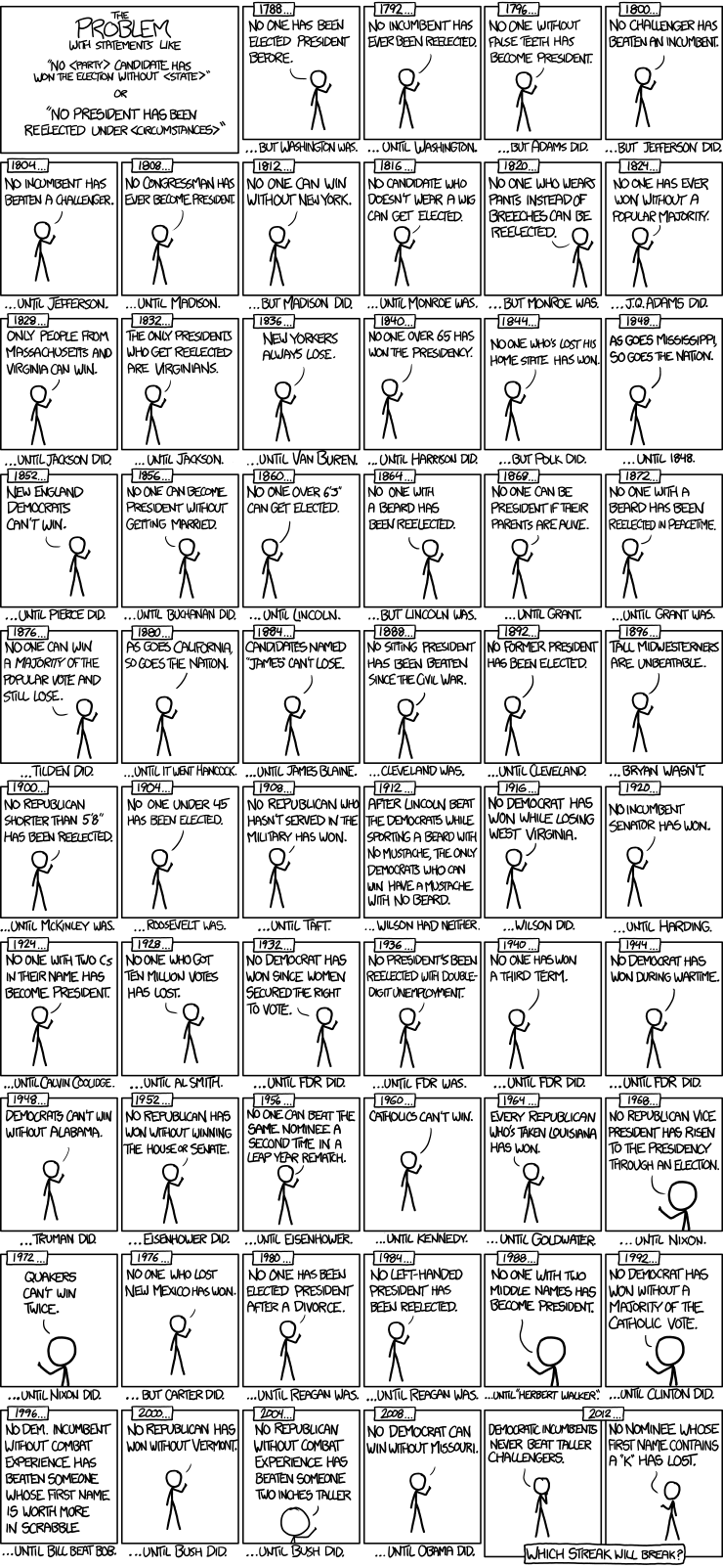
XKCD hits the nail on the head yet again with a great commentary on election year "no one has ever _____ and won the White House" musings.

These drive me nuts because obviously we have an incredibly small sample size.  Our country may have been around for quite some time now, but we've only had 44 presidents.  Think about how few people that really is.

Additionally, states change, demographics change, and the electoral college system is ridiculous.  This gives rise to all sorts of statistical "anomalies" that really are quite probable when you think of how few events we're looking at.

The sports world does this too, baseball probably more than the rest of them.  While watching the post season this year with my long suffering Oriole's fan husband, we got quite a kick out of pointing out how specific some of the stats they brought up were.  "He's 1 for 3 when facing Sabathia during the post season over the last 3 years".  Four at bats over a whole career and we're supposed to draw some sort of conclusion from this?  Sigh.

Anyway, here's the comic.  Happy Thursday.

Monday, October 15, 2012

Lance Armstrong and False Positives

Well the talk went well.

I'm waiting for the official rating (people fill out anonymous evals), but there seemed to be a lot of interest....and more importantly I got quite a few compliments on the unique approach.  Giving people something new in the "how to get along" genre was my goal, so I was pleased.

Between that and having 48 hours to pull together another abstract for submission to a transplant conference, posting got slow.

It was interesting though....the project I was writing the abstract was about a new test we introduced that saved patients over an hour of waiting time IF it came out above a certain level.  We had hours of discussion about where that should be, ultimately deciding that we had to minimize false positives (times when the test said they passed but a better test said they failed) at the cost of driving up false negatives (when the test said they failed, but they really hadn't).  We have to perform the more accurate test regardless, so it was a choice between having a patient wait unnecessarily, or having them start an expensive uncomfortable procedure unnecessarily.  Ethically and reasonably, we decided most patients would rather find out they'd waited when they didn't have to than that they'd gotten an entirely unnecessary procedure.

I bring all this up both to excuse my absence and to say I was fascinated by Kaiser Fung's take on Lance Armstrong.  He goes in depth about anti-doping tests, hammering on the point that testing agencies will accept high false negatives to minimize false positives.  It would ruin their credibility to falsely accuse someone, so we have to presume many many dopers test clean at various points in time.  It follows then, that clean tests mean fairly little, while other evidence means quite a lot.

I thought that was an interesting point, one I had certainly not heard covered.

Also, as any Orioles fan (or someone who lives with one) would know, I have good reason to want Raul Ibanez tested right now.

More posts this week than last, I promise.

Saturday, October 6, 2012

Weekend of Distraction

Posting's been a bit slow this week, as I've been ridiculously distracted by an upcoming conference this weekend.

On the plus side, if anyone cares to hear my thoughts on inter-professional differences in communication and conflict, I'll be speaking on it Sunday morning at 8:30am at the AABB meeting at the Boston Convention Center.

Normally my public speaking style is fairly laid back and has some improvising....but as I haven't been able to string too many coherent sentences together for the past few weeks post-baby, I'm a little nervous about this talk.  Thus blogging time has turned in to "practice your talk" time.  I'm hoping that winds up being a good trade.

Any prayers/good vibes/happy thoughts would be appreciated.

Also, you'd like my talk.  I use the sentence "so this is a little kumbaya, why should care in the real world?".

I think that sentence should be used in all talks about how to get along in the workplace.

I also raise the idea that diversity of thought is an incredibly under recognized aspect of diversity, and that's not a good thing.

I think that idea should come up in every talk where the word "diversity" is mentioned.

Tuesday, October 2, 2012

More beer and politics

I have a love hate relationship with graphs like these (from the National Journal).

On the hate side - implications of correlation and causation, using random variables to grab headlines.

On the love side - oh!  colors!  bubbles!  Fun!!!!!

The data for this one actually looks pretty good....survey results for over 200,000 people....and the survey was done by a polling group and not, say a beer manufacturer.

A pretty good breakdown of some of the data is here.  They point out some funny things, like the proximity of Romney campaign headquarters to the Sam Adams brewery, and that the most likely Dems to turn out actually drink a Canadian beer (Molson).

Shiner Bock makes sense to me as I've only seen it sold in Texas and parts thereabout, and Corona always makes me think of the spring break crowd.

I'm a hard cider girl myself, though that's due to an allergy.  I guess it is true that I skew Democrat, but mostly because in Massachusetts all your local races are pretty much uncontested Dems....so I probably have voted for vastly more Dems than Repubs in my life.

I'd like to see a bit of a note on how the size of the circle relates to absolute number of people (is that Lone Star drinker in the corner just one guy or 10?) but overall, this is fun.  It will definitely compliment the debate drinking game well.  Stay thirsty my friends.