It's always been interesting to me how misleading the regular red/blue electoral map is:
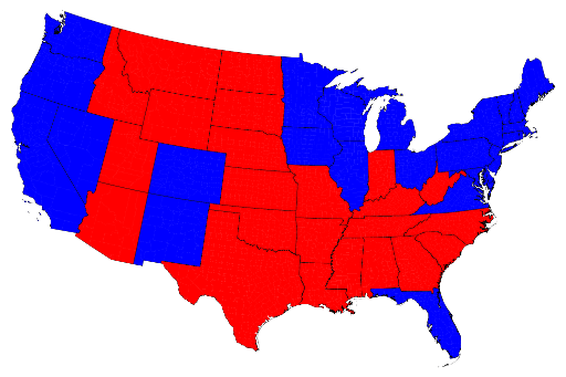
This always makes it look like the red should easily have outnumbered the blue. The link shows different breakdowns to account for population by state:
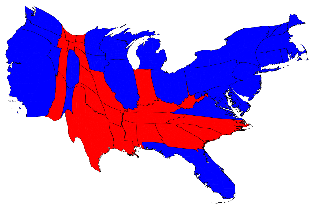
He includes breakdowns by county, and some with shades of purple to represent splits. Interesting stuff.
All states are purple.
ReplyDeleteThere is considerable resistance to the idea of illustrating a lot of red-blue money-in/money-out, voting, test scores, obesity rates, etc stuff in terms of the purpleness of counties, because then the racial issues can't help but suggest themselves. And none of us wants to discuss the issues in those terms, even if it might be illuminating at times. (Even I don't want that.)
I apologise for the cowardliness, but there it is.